
Titanic Survival Prediction
In this notebook we will explore the Titanic passengers data set made available on Kaggle in the Getting Started Prediction Competition - Titanic: Machine Learning from Disaster. We will be using Python along with the Numpy, Pandas, and Seaborn libraries to load, explore, manipulate and visualize the data. Finally, we will build some models to use as predictors of survival and evaluate their efficacy.
Loading libraries
We start off by loading the required libraries, as follows.
# Ensure floating point numbers are returned instead of zero
from __future__ import division

# Ensure graphs render inline in the notebook.
%matplotlib inline

import numpy as np
import pandas as pd
import seaborn as sns
import matplotlib.pyplot as plt

# set overall font scale to use in charts
sns.set(font_scale=1.1);
sns.set_style("whitegrid");
sns.despine();
plt.close(1);

# Single colour palettes for good and bad outcomes
good_palette = ['#44cc44']
bad_palette = ['#cc4444']
# Colour palette for gender - traditional light pink (female), light blue (male)
gender_palette = ['#B0C4DE','#FFB6C1']
# Colour palette for ticket class - gold (first), silver (second), bronze (third)
class_palette = ['#FFD700','#C0C0C0','#CD7F32']

# Function to plot percentage on top of factor plots
# Credit: Adapted from http://stackoverflow.com/a/31754317
def showPercentageFactorPlot(axes):
    for p in axes.patches:
        height = p.get_height()
        axes.text(p.get_x() + p.get_width()/2., height + 0.01, '{:1.1f}%'.format(height*100), ha="center")
Loading the data
Next, we will use pandas to load the comma separated values from the train and test CSV files downloaded from the Kaggle web site.
raw_train_data = pd.read_csv("train.csv");
raw_test_data = pd.read_csv("test.csv");
Verifying train - test split
To evaluate the ability of a model to make predictions on new data, i.e. determine whether it is able to generalize, a data set needs to be split between a training set and a testing set. The latter is used only once to evaluate the different models trained, to determine which one should perform the best on new data. The test set, i.e. the unseen data that was never used to train, serves to simulate how the trained models will most likely behave in the wild.
For this train - test split to work correctly, both sets should be representative of each other, i.e. there should be roughly the same mixture of proportions in both sets. For example, in the Titanic data set case, both train and test sets should roughly have the same proportion of male/female passengers, same proportion of survivors and so on. The data sets we are working on here have been prepared by the Kaggle team, so they are already split appropriately, however, we will still explore these aspects next to learn how it should be done.
**Note: **In this case we will not be able to validate whether there is a similar proportion of positive outcomes, i.e. survivors between train and test set, since of course the test set does not include the survivor column, which we will try to predict later on in this notebook.
Proportion of male/female passengers
First, we will print the number of records in each set and then compute the female proportion in each set to compare them.
print "Training set - sex proportions"
train_sex_counts = raw_train_data[['Sex','PassengerId']].groupby(['Sex']).count()
train_sex_counts = train_sex_counts / train_sex_counts.sum()
train_sex_counts.columns = ['Proportions']
print train_sex_counts.round(2)
print
print "Testing set - sex proportions"
test_sex_counts = raw_test_data[['Sex','PassengerId']].groupby(['Sex']).count()
test_sex_counts = test_sex_counts / test_sex_counts.sum()
test_sex_counts.columns = ['Proportions']
print test_sex_counts.round(2)
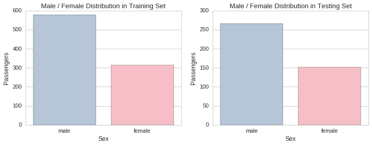
Training set - sex proportions
        Proportions
Sex
female         0.35
male           0.65

Testing set - sex proportions
        Proportions
Sex
female         0.36
male           0.64
The proportion of males to females is approximately the same in both training and testing sets. There was approximately a female passenger for every two male passengers. This can also be determined visually by plotting the respective gender distributions in each set.
f, (ax1, ax2) = plt.subplots(1,2, figsize=(12,4))
ax1.set_title("Male / Female Distribution in Training Set")
sns.countplot(x="Sex", data=raw_train_data, palette=gender_palette, ax=ax1)
ax1.set_ylabel("Passengers")
ax2.set_title("Male / Female Distribution in Testing Set")
sns.countplot(x="Sex", data=raw_test_data, palette=gender_palette, ax=ax2)
ax2.set_ylabel("Passengers");
Proportion of first/second/third class passengers
Next, we will look at the proportion of passengers with a first/second/third class ticket in each set. This is an important factor to look into, since, along with gender, is a good predictor variable for survival. A predictor variable or independent variable is in machine learning called a feature. The features you use to model the data and make predictions have a big impact on how successful the model is. Feature selection and engineering is in many cases determined by human domain experts, although automated methods to help choose features, such as dimensionality reduction or clustering, and automatic representation learning through neural networks do exist.
In this case, having knowledge about the Titanic disaster and how it unfolded, helps to choose certain variables over others in modelling the problem. Unfortunately, the Titanic ship was not equipped with enough life saving emergency boats and so some predictable and questionable choices were made on who gets to go first on the boats. Predictably, women and children were in their majority given preference to go first. Also, irrespective of gender, preference seems to have been questionably given to first class ticket holders.
We will now compute the proportion of ticket holders by class and plot their respective distributions for visual inspection.
print "Training set - ticket class proportions."
train_class_counts = raw_train_data[['Pclass','PassengerId']].groupby(['Pclass']).count()
train_class_counts.columns = ['Proportion']
train_class_counts.index.names = ['Ticket Class']
print train_class_counts / train_class_counts.sum()
print
print "Testing set - ticket class proportions."
test_class_counts = raw_test_data[['Pclass','PassengerId']].groupby(['Pclass']).count()
test_class_counts.columns = ['Proportion']
test_class_counts.index.names = ['Ticket Class']
print test_class_counts / test_class_counts.sum()
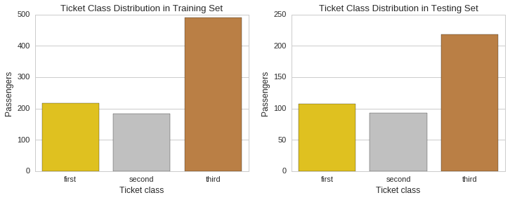
Training set - ticket class proportions.
              Proportion
Ticket Class
1               0.242424
2               0.206510
3               0.551066

Testing set - ticket class proportions.
              Proportion
Ticket Class
1               0.255981
2               0.222488
3               0.521531
f, (ax1, ax2) = plt.subplots(1,2, figsize=(12,4))
ax1.set_title("Ticket Class Distribution in Training Set")
sns.countplot(x="Pclass", data=raw_train_data, palette=class_palette, ax=ax1)
ax1.set_ylabel("Passengers")
ax1.xaxis.set_ticklabels(["first","second","third"])
ax1.set_xlabel("Ticket class")
ax2.set_title("Ticket Class Distribution in Testing Set")
sns.countplot(x="Pclass", data=raw_test_data, palette=class_palette, ax=ax2)
ax2.set_ylabel("Passengers")
ax2.xaxis.set_ticklabels(["first","second","third"])
ax2.set_xlabel("Ticket class");
Distribution of ages
Another dimension we need to check is the distribution of ages in both training and testing sets. We will do this visually by plotting histograms for each and compare them visually.
# Some entries have no age specified and so we have to remove these records before plotting the histogram
train_age_data = raw_train_data[raw_train_data['Age'].notnull()]
test_age_data = raw_test_data[raw_test_data['Age'].notnull()]

f, (ax1, ax2) = plt.subplots(1,2, figsize=(12,4))
ax1.set_title("Passenger age distribution in training set")
sns.distplot(train_age_data.Age, bins=np.arange(0, 110, 10), kde=False, ax=ax1)
ax1.set_ylabel("Passengers")
ax2.set_title("Passenger age distribution in testing set")
sns.distplot(test_age_data.Age, bins=np.arange(0, 110, 10), kde=False, ax=ax2)
ax2.set_ylabel("Passengers");
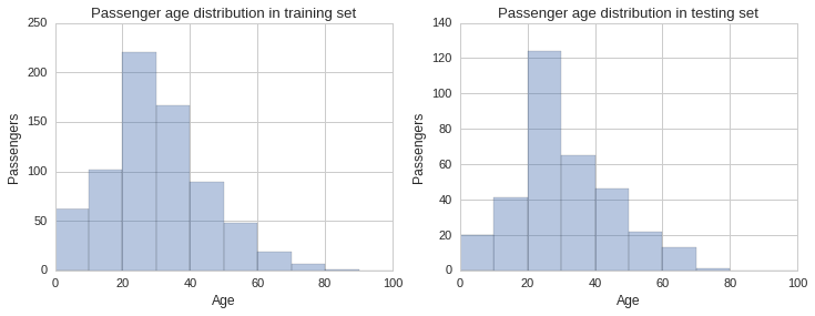
From the histograms plotted above one gets a sense the age distribution is similar across sets, however, there are some slight differences, especially in the 30 to 40 year bracket. To get a better sense of the distribution we can plot the estimated probability density function of the Age variable using a kernel density estimate plot, as shown below.
f, (ax1) = plt.subplots(1,1, figsize=(12,4))
ax1.set_title("Passenger age distribution KDE plot - train vs test set")
sns.kdeplot(train_age_data.Age, shade=True, ax=ax1)
sns.kdeplot(test_age_data.Age, shade=True, ax=ax1);
ax1.set_xlabel("Age")
plt.legend(['Training','Testing'])
plt.xlim(0, 100);
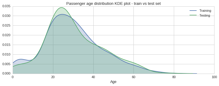
The green shaded KDE plot, for the testing set, confirms that there is slightly more data in the 20 to 30 years bracket, compared to the training set. This however is acceptable since overall the distributions look quite similar.
Distribution by number of accompanying relatives
The data set includes two fields, SibSp, which stands for siblings and spouse, and Parch, which stands for parents and children. These numeric fields show whether the passenger had any relatives onboard the ship with them. Since being part of a group of people might help or hinder your chances of making it onto a lifeboat, and so might be an important factor to include in our prediction model, it is important to also check its distribution across the training and testing sets.
bins = np.linspace(0, 8, 9)
f, (ax1, ax2) = plt.subplots(1,2, figsize=(12,4))
ax1.set_title("Accompanying relatives distribution - training set")
sns.distplot(train_age_data.SibSp + train_age_data.Parch, bins=bins, kde=False, ax=ax1)
ax1.set_ylabel("Passengers")
ax1.set_xlabel("Number of accompanying relatives")
ax2.set_title("Accompanying relatives distribution - testing set")
sns.distplot(test_age_data.SibSp + test_age_data.Parch, bins=bins, kde=False, ax=ax2);
ax2.set_ylabel("Passengers")
ax2.set_xlabel("Number of accompanying relatives")

f, (ax1) = plt.subplots(1,1, figsize=(12,4))
ax1.set_title("Accompanying relatives distribution KDE plot - train vs test set")
sns.kdeplot(train_age_data.SibSp + train_age_data.Parch, shade=True, ax=ax1)
sns.kdeplot(test_age_data.SibSp + test_age_data.Parch, shade=True, ax=ax1);
ax1.set_xlabel("Number of accompanying relatives")
plt.legend(['Training','Testing'])
plt.xlim(0, 8);
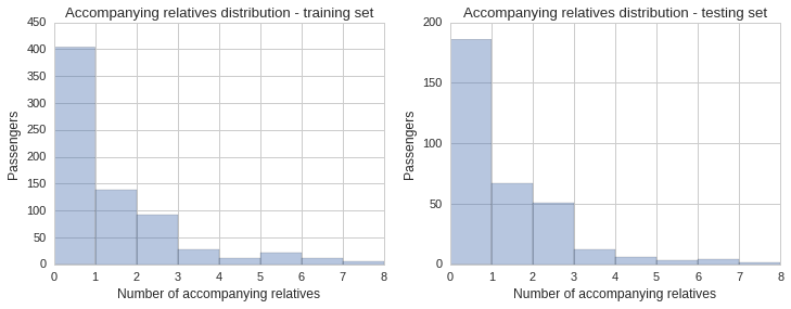
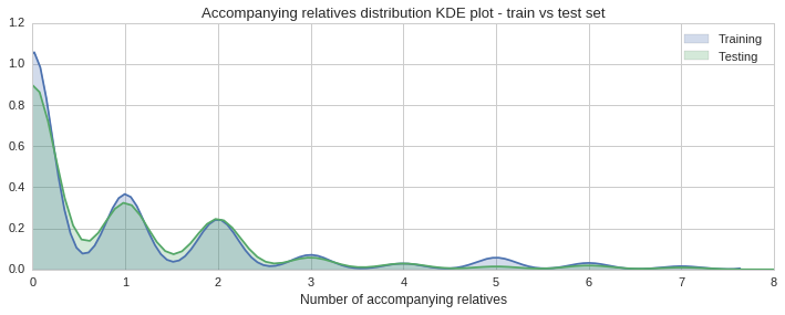
The histogram and KDE plot show a similar distribution of accompanying relatives in both sets.
Conclusion on the train/test split
The distributions of genders, ticket classes, ages and number of accompanying relatives are approximately the same across both training and testing. Therefore, the training / testing split is valid and the aforementioned independent variables can be used to build our survival prediction model.
Exploring the survivors in the training set
Now that we have determined that the training/testing sets are appropriately split, we can move on to exploring the training set to identify any trends in relation to surviving the disaster.
**Note: ** Surviving is denoted by 1, true, while not surviving is denoted by 0, false.
We will first plot a survival categorical distribution using countplot, and then look for trends by splitting the survivability by the independent variables we think have the biggest correlation with surviving or not.
Overall survival
f, (ax1, ax2) = plt.subplots(1,2, figsize=(12,4))
ax1.set_title('Distribution of passengers by survival - training set')
sns.countplot(x="Survived", data=raw_train_data, ax=ax1, palette=bad_palette + good_palette)
ax1.set_ylabel("Passengers")
ax1.xaxis.set_ticklabels(["no","yes"])
ax2.set_title('Proportion of passengers surviving')
sns.factorplot(y="Survived", data=raw_train_data, kind='bar', ci=None, palette=good_palette, ax=ax2);
ax2.set_ylabel("")
ax2.set_ylim((0,0.5))
showPercentageFactorPlot(ax2)
plt.close(2);
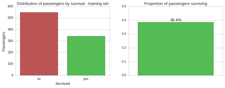
Based on the training set, which should be representative of the whole population, the vast majority of passengers aboard the Titanic unfortunately did not make it. Let us now see this split by gender.
Survivability by gender
f, (ax1, ax2) = plt.subplots(1,2, figsize=(12,4))
sns.countplot(x="Sex", hue="Survived", data=raw_train_data, palette=bad_palette+good_palette, ax=ax1);
ax1.set_title("Survivors by gender")
ax1.set_ylabel("Passengers")
ax1.legend(['no','yes'], title="Survived")
sns.factorplot(x="Sex", y="Survived", data=raw_train_data, kind='bar', ci=None, palette=good_palette, ax=ax2)
ax2.set_title("Proportion of survivors by gender");
ax2.set_ylabel("")
showPercentageFactorPlot(ax2)
plt.close(2);
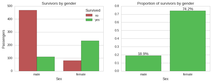
From the above plots it is very clear that the absolute majority of female passengers survived ~74%, while the majority of male passengers died, with only ~19% surviving. So gender seems to be a very strong predictor of survivability in this case. Next, we will look into survivability split by ticket class.
Survivability by ticket class
f, (ax1, ax2) = plt.subplots(1,2, figsize=(12,4))
sns.countplot(x="Pclass", hue="Survived", data=raw_train_data, palette=bad_palette+good_palette, ax=ax1);
ax1.set_title("Survivors by ticket class")
ax1.set_ylabel("Passengers")
ax1.set_xlabel("Ticket Class")
ax1.legend(['no','yes'], title="Survived", loc=0)
sns.factorplot(x="Pclass", y="Survived", data=raw_train_data, kind='bar', ci=None, palette=good_palette, ax=ax2)
ax2.set_title("Proportion of survivors by ticket class");
ax2.set_ylabel("")
ax2.set_xlabel("Ticket Class")
showPercentageFactorPlot(ax2)
plt.close(2);
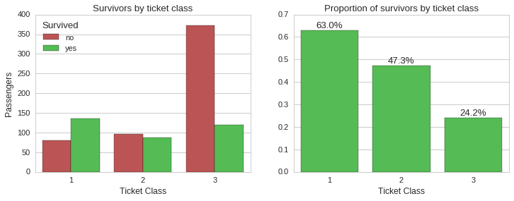
Here we can see that ticket class played an important role in determining who got a spot on the limited seats in the lifeboats, in turn affecting the chance of surviving the disaster. While ~63% of first class ticket holders survived, only ~24% of third class ticket holders did.
We can check whether this holds for both genders as follows.
f, ((ax1, ax2), (ax3, ax4)) = plt.subplots(2,2, figsize=(12,10))
sns.countplot(x="Pclass", hue="Survived", data=raw_train_data[raw_train_data.Sex == "male"], palette=bad_palette+good_palette, ax=ax1);
ax1.set_title("Survivors by ticket class - Males")
ax1.legend(['no','yes'], title="Survived", loc=0)
ax1.set_xlabel("Ticket Class")
ax1.set_ylabel("Passengers")
sns.factorplot(x="Pclass", y="Survived", data=raw_train_data[raw_train_data.Sex == "male"], kind='bar', ci=None, palette=good_palette, ax=ax2)
ax2.set_title("Proportion of survivors by ticket class - Males");
ax2.set_ylabel("")
ax2.set_xlabel("Ticket Class")
showPercentageFactorPlot(ax2)

sns.countplot(x="Pclass", hue="Survived", data=raw_train_data[raw_train_data.Sex == "female"], palette=bad_palette+good_palette, ax=ax3);
ax3.set_title("Survivors by ticket class - Females")
ax3.legend(['no','yes'], title="Survived", loc=0)
ax3.set_xlabel("Ticket Class")
ax3.set_ylabel("Passengers")
sns.factorplot(x="Pclass", y="Survived", data=raw_train_data[raw_train_data.Sex == "female"], kind='bar', ci=None, palette=good_palette, ax=ax4)
ax4.set_title("Proportion of survivors by ticket class - Females");
ax4.set_ylabel("")
ax4.set_xlabel("Ticket Class")
showPercentageFactorPlot(ax4)
plt.close(2);
plt.close(3);
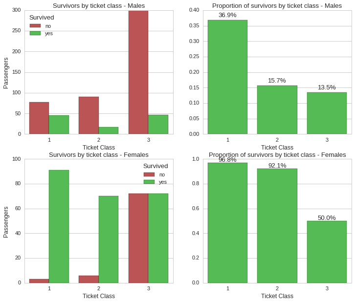
While ticket class still held a significant correlation to survivability, gender still looks like the most significant factor. For instance, while ~97% of female first class ticket holders survived, only ~37% male first class ticket holders did. This holds true for all classes, where for instance, third class ticket holders had a survival rate of ~50% for females and ~14% for males.
Survivability by age
We now look at the age of passengers and whether this had a bearing on surviving the disaster. First we look at survival proportions between young people (up to 18 years) and adults (over 18 years).
train_age_data = train_age_data.assign(adult = lambda x: x.Age >= 18)

f, (ax1, ax2) = plt.subplots(1,2, figsize=(12,4))
sns.countplot(x="adult", hue="Survived", data=train_age_data, palette=bad_palette+good_palette, ax=ax1);
ax1.set_title("Survivability by age")
ax1.set_ylabel("Passengers")
ax1.legend(['no','yes'], title="Survived", loc=0)
sns.factorplot(x="adult", y="Survived", data=train_age_data, kind='bar', ci=None, palette=good_palette, ax=ax2)
ax2.set_title("Proportion of survivors by age");
ax2.set_ylabel("")
showPercentageFactorPlot(ax2)
plt.close(2)
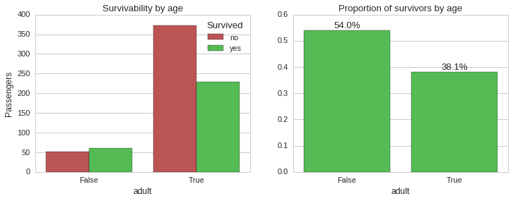
Clearly, being young increased your chances of surviving. Let us see how age and survivability correlate if we also take into consideration gender and ticket class.
g = sns.FacetGrid(train_age_data, row="Sex", col="Pclass", hue="Survived", palette=bad_palette+good_palette, margin_titles=True, aspect=1.5)
bins = np.linspace(0, 100, 11)
g.map(sns.distplot, "Age", bins=bins, kde=False, rug=False);
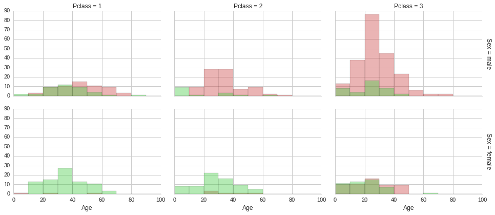
The above histograms show that irrespective of ticket class and gender, being young made it more likely to survive. This of course does not explain why being young increased the chances of surviving, it is just a correlation, not causation. Multiple factors could be at play. Culturally children are given precedence in taking up space on lifeboats in these scenarios. Also, younger people are usually more agile and mobile, so it easier to make it to a lifeboat. Furthermore, if young adults do not make it to a lifeboat, they are more likely to survive until a rescue boat arrives, since in general they would be in better physical shape than an older adult. Although surviving in freezing arctic waters for more than a few minutes is not easy for anyone.
Next, we shall look at the relation between survivability and the number of accompanying relatives.
Survivability by number of accompanying relatives
# Add a new column 'relatives' equal to the number of relatives accompanying each passenger
# i.e. sum of siblings, spouse, parents and children
train_age_data = train_age_data.assign(relatives = lambda x: x.SibSp + x.Parch)

f, (ax1, ax2) = plt.subplots(1,2, figsize=(12,4))
sns.countplot(x="relatives", hue="Survived", data=train_age_data, palette=bad_palette+good_palette, ax=ax1);
ax1.set_title("Survivors by number of relatives on board")
ax1.set_ylabel("Passengers")
ax1.legend(['no','yes'], title="Survived")
sns.factorplot(x="relatives", y="Survived", data=train_age_data, kind='bar', ci=None, palette=good_palette, ax=ax2)
ax2.set_title("Proportion of survivors by relatives on board");
ax2.set_ylabel("")
ax2.set_ylim(0, 0.9)
showPercentageFactorPlot(ax2)
plt.close(2);
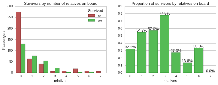
The above plots shows that the majority of passengers who had one, two or three accompanying relatives survived, while all the other categories had less than 34% chance of survival. Let us now look at the distribution of accompanying relatives by ticket class and the survivability.
f, ax1 = plt.subplots(1,1, figsize=(14,4))
sns.countplot(x="relatives", hue="Pclass", palette=class_palette, data=train_age_data, ax=ax1);
ax1.set_title("Distribution of accompanying relatives per ticket class")
ax1.legend(['First','Second','Third'], title="Ticket class");

g = sns.FacetGrid(train_age_data, col="Pclass", hue="Survived", palette=bad_palette+good_palette, margin_titles=True, size=4, aspect=1)
bins = np.linspace(0, 8, 9)
g.map(sns.distplot, "relatives", bins=bins, kde=False, rug=False);
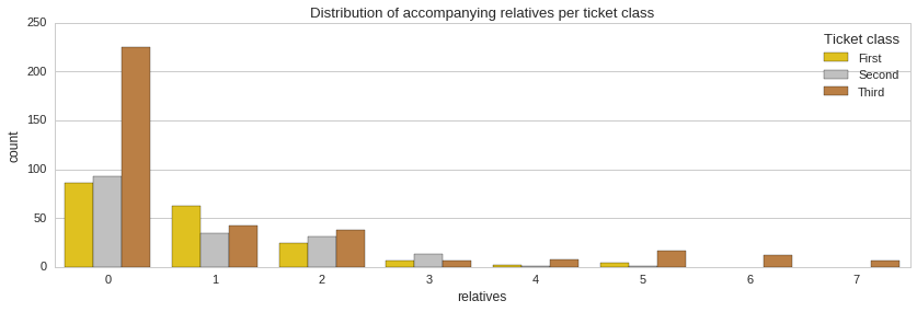
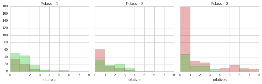
From the distribution of accompanying relatives it is apparent that the majority of passengers did not have any relatives on board with them. Also, it is clear that a minority of third class ticket holders were whole families with four or more accompanying relatives. Unfortunately, the majority of these people did not make it.
Survivability based on title
We finally look at whether the title prefix of passenger names has any bearing on whether the passenger survives or not. To achieve this we will create a new column Title filled with the title extracted from the Name column and then plot a factorplot to see the proportion of people surviving for each title.
# Names have the following general format 'FamilyName, Title. FirstName SecondName'
train_age_data['Title'] = train_age_data.apply(lambda row: row['Name'][row['Name'].find(',')+1:row['Name'].find('.')].strip(), axis=1)

f, (ax1, ax2) = plt.subplots(1,2, figsize=(17,4))
sns.countplot(x="Title", hue="Survived",
              data=train_age_data[train_age_data['Title'].isin(['Mr', 'Mrs', 'Miss', 'Master'])],
              palette=bad_palette+good_palette,
              ax=ax1);
ax1.set_title("Passengers by title")
ax1.set_ylabel("Passengers")
ax1.legend(['no','yes'], title="Survived")

cp = sns.countplot(x="Title", hue="Survived",
                   data=train_age_data[train_age_data['Title'].isin(['Mr', 'Mrs', 'Miss', 'Master']) == False],
                   palette=bad_palette+good_palette,
                   ax=ax2);
ax2.set_title("Passengers by title")
ax2.set_ylabel("Passengers")
ax2.legend(['no','yes'], title="Survived")
cp.set_xticklabels(cp.get_xticklabels(), rotation=30)

f, ax1 = plt.subplots(1,1, figsize=(17,4))
sns.factorplot(x="Title", y="Survived", data=train_age_data, kind='bar', ci=None, palette=good_palette, ax=ax1)
ax1.set_title("Proportion of survivors by title");
ax1.set_ylabel("")
ax1.set_ylim(0, 1.2)
showPercentageFactorPlot(ax1)
plt.close(3);
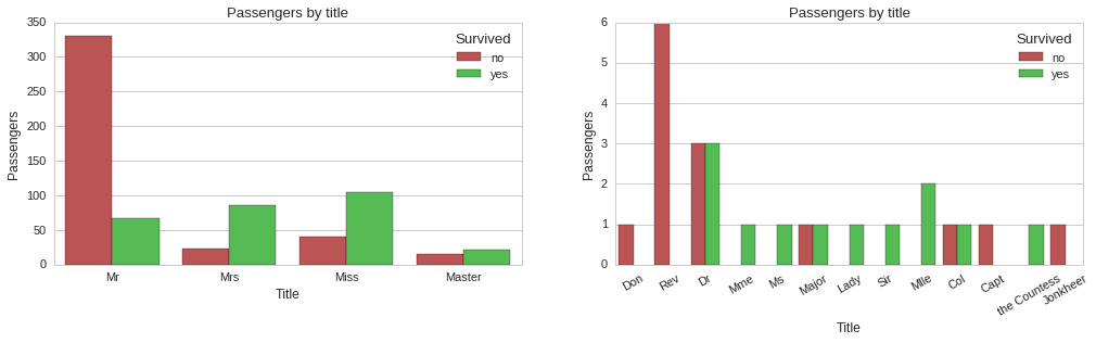
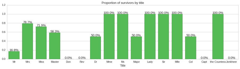
The above plots show some correlation between title and survivability. For instance, all reverends, ‘Rev’ title, died, while doctors, majors and colonels had a 50% chance of surviving. Since title does seem to carry some information about survivability, we will include it as a feature of our models.
Conclusions on survivability
The proportion of people in the training set surviving the Titanic disaster was analysed with regards to five independent variables, namely, gender, ticket class, age, number of accompanying relatives and title. All five variables show strong correlations to survivability and make for good predictor variables.
For instance, an old man with a third class ticket accompanied by more than four relatives is near certain not to survive. On the other hand, a young female with a first class ticket accompanied by less than four relatives is most likely to survive.
We will now use these features to build predictive models and evaluate their performance in predicting who survives, using unseen data.
Predictive Modeling
Performance metric for evaluation of predictive model
The Kaggle challenge page specifies that accuracy will be used to evaluate the predicitve ability of the model.
\[Accuracy = { {TP + TN}\over{TP + FP + FN + TN} }\]In the training set ~38.4% of passengers survive, so the distribution of binary outcomes is slightly skewed. If we had to build a model that predicts not suriving for all inputs, and consider a true positive to mean prediciting not suriving when this is what actually happens, then the model would have an accuracy of 61.6%. Just saying this so as to show that with a skewed distribution one has to be careful not to overfit a particular class of outcomes. Also, the model we build must have an accuracy much better than 61.6% or might as well hard-code the prediction.
How to handle missing data in the age independent variable
Both training and testing sets include records with a missing value for the age field. Since we plan to use age as a feature in our predictive models, we need to somehow fill in the missing data as best as we can. One way to do this is to randomly sample from the distribution of ages we have in the training and testing set combined.
Another method we could use is to exploit domain knowledge to make a more educated guess of the age. Instead of sampling from an age distribution for all passengers in the dataset, we could use five different age distributions, one for each of the titles ‘Mr.’, ‘Mrs.’, ‘Master’, ‘Miss’ and any other title.
Let us start by plotting the histograms for each title group to visualise any differences in age distribution.
titles = [', Mr\.',', Mrs\.',', Miss\.',', Master\.']
re_titles = '|'.join(titles)

f, (ax1, ax2, ax3, ax4, ax5) = plt.subplots(1,5, figsize=(17,3))
bins = np.linspace(0, 100, 41)
sns.distplot(train_age_data[train_age_data.Name.str.contains(titles[0])].Age, bins=bins, kde=True, ax=ax1)
sns.distplot(train_age_data[train_age_data.Name.str.contains(titles[1])].Age, bins=bins, kde=True, ax=ax2)
sns.distplot(train_age_data[train_age_data.Name.str.contains(titles[2])].Age, bins=bins, kde=True, ax=ax3)
sns.distplot(train_age_data[train_age_data.Name.str.contains(titles[3])].Age, bins=bins, kde=True, ax=ax4)
sns.distplot(train_age_data[train_age_data.Name.str.contains(re_titles) == False].Age, bins=bins, kde=True, ax=ax5)

ax1.set_title("Age distribution for Mr.")
ax2.set_title("Age distribution for Mrs.")
ax3.set_title("Age distribution for Miss.")
ax4.set_title("Age distribution for Master.")
ax5.set_title("Age distribution for other titles.")

f, (ax1) = plt.subplots(1,1, figsize=(17,5))
ax1.set_title("Passenger age distribution by title - KDE plot")
sns.kdeplot(train_age_data[train_age_data.Name.str.contains(titles[0])].Age, shade=False, ax=ax1)
sns.kdeplot(train_age_data[train_age_data.Name.str.contains(titles[1])].Age, shade=False, ax=ax1)
sns.kdeplot(train_age_data[train_age_data.Name.str.contains(titles[2])].Age, shade=False, ax=ax1)
sns.kdeplot(train_age_data[train_age_data.Name.str.contains(titles[3])].Age, shade=False, ax=ax1)
sns.kdeplot(train_age_data[train_age_data.Name.str.contains(re_titles) == False].Age, shade=False, ax=ax1)

ax1.set_xlabel("Age")
plt.legend(['Mr.','Mrs.','Miss.','Master.','Other title'])
plt.xlim(0, 100);
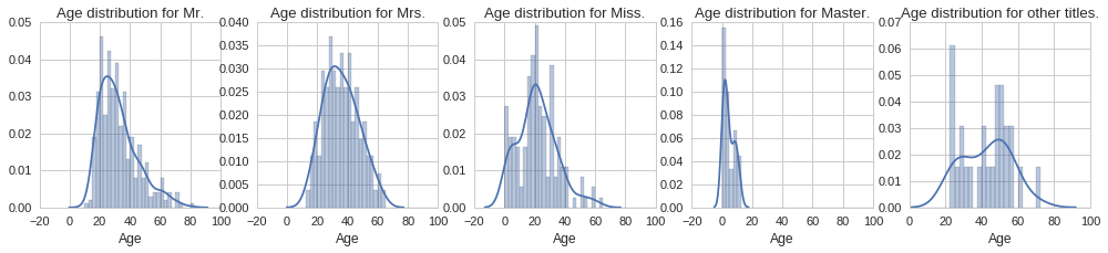
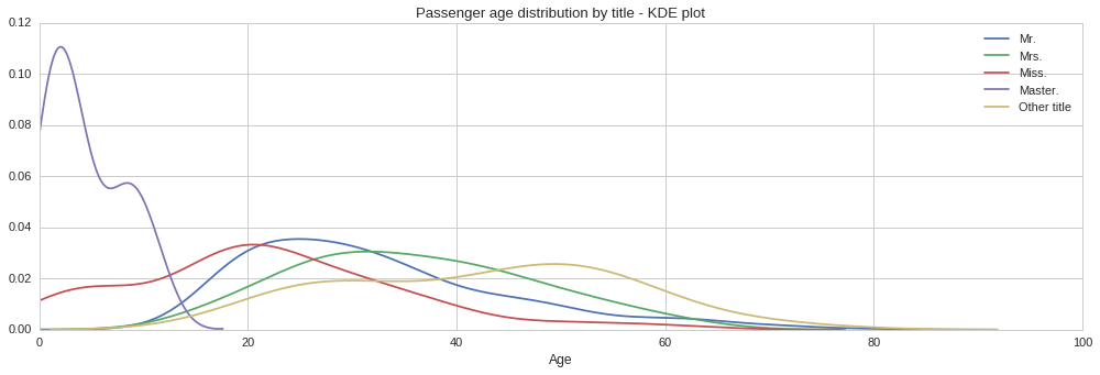
From the above plots we can see quite different age distributions based on title. Some are expected, such as the tight age distribution around 0 to 15 years for the ‘Master’ title. Similarly the age distribution extends all the way to zero for the ‘Miss’ title since this is used both for single women and girls. Interestingly, the age distribution for men, ‘Mr.’ title, is positively skewed, with the majority of men being in their early 20s. On the other hand, the age distribution for women, ‘Mrs.’ title, looks normally distributed, however it looks like women were on average slightly older. Let us compute the mean age for each title, so that we can use each to fill the corresponding missing age according to the title.
mean_age_mr = train_age_data[train_age_data.Name.str.contains(titles[0])].Age.mean()
mean_age_mrs = train_age_data[train_age_data.Name.str.contains(titles[1])].Age.mean()
mean_age_miss = train_age_data[train_age_data.Name.str.contains(titles[2])].Age.mean()
mean_age_master = train_age_data[train_age_data.Name.str.contains(titles[3])].Age.mean()
mean_age_other = train_age_data[train_age_data.Name.str.contains(re_titles) == False].Age.mean()

print "Mean age for 'Mr.' title: {0:.0f}".format(mean_age_mr)
print "Mean age for 'Mrs.' title: {0:.0f}".format(mean_age_mrs)
print "Mean age for 'Miss.' title: {0:.0f}".format(mean_age_miss)
print "Mean age for 'Master.' title: {0:.0f}".format(mean_age_master)
print "Mean age for other title: {0:.0f}".format(mean_age_other)
Mean age for 'Mr.' title: 32
Mean age for 'Mrs.' title: 36
Mean age for 'Miss.' title: 22
Mean age for 'Master.' title: 5
Mean age for other title: 42
So now we can make copies of the original training and testing data sets, on which we can fill in the missing age values, add the Title column based on the Name column and remove the columns we do not plan to use in building our predicitve models.
def age_for_title(title):
    '''
    Return the appropriate mean age for the title used.
    '''
    if ', Mr.' in title:
        return mean_age_mr
    elif ', Mrs.' in title:
        return mean_age_mrs
    elif ', Miss.' in title:
        return mean_age_miss
    elif ', Master.' in title:
        return mean_age_master
    else:
        return mean_age_other

# Make copies of the training and testing data sets and store them in one dataframe ready for processing.
cleaned_data = raw_train_data.copy()
cleaned_data = cleaned_data.append(raw_test_data.copy())

# Fill in the missing age data
cleaned_data.loc[cleaned_data.Age.isnull(),'Age'] = cleaned_data[cleaned_data.Age.isnull()].apply(lambda row: age_for_title(row['Name']), axis=1)

# Create and fill the Title column using the data in the Name column
# Names have the following general format 'FamilyName, Title. FirstName SecondName'
cleaned_data['Title'] = cleaned_data.apply(lambda row: row['Name'][row['Name'].find(',')+1:row['Name'].find('.')].strip(), axis=1)

# Delete all the columns we do not intend to use in our models.
cleaned_data = cleaned_data.drop(['PassengerId','Name','Ticket','Fare','Cabin','Embarked'], axis=1)
Preparing the data for modeling
Some of the features we will be using, such as sex and ticket class, are categorical variables, i.e. not numeric, and so take labels as values, for example, sex can either be male or female. While some machine learning algorithms, for example, decision tree can handle categorical variables natively, many others do not, such as SVM, logistic regression or neural networks.
In these instances, categorical variables need to be converted to numerical. However, to avoid introducing a distance, order or implicit meaning, categorical variables should not be replaced with a number, say female with 1 and male with 2. Instead, a technique called one-hot encoding is used, where new columns are added for each value a categorical variable might take, say sex_female and sex_male for the sex variable, and then each record would just have the field matching the categorical variable value to 1 and all the others to zero. So, for instance, a male passenger would have sex_female set to zero and sex_male to 1, and vice versa for a female passenger.
Luckily for us this can easily be done using the pandas library get_dummies function.
Note: Although decision trees natively support categorical variables, the implementation in scikit-learn does not and so the one-hot encoding will be required even for evaluating the decision tree model.
categorical_columns = ['Sex','Pclass','Title']
# One-hot encode categorical columns
ohe_cleaned_data = pd.get_dummies(cleaned_data, columns = categorical_columns)

print "Original fields: {0}".format(', '.join(list(cleaned_data.columns)))
print "One-hot encoded fields: {0}\n".format(', '.join(list(ohe_cleaned_data.columns)))

outcome = 'Survived'
features = list(ohe_cleaned_data.columns)
features.remove(outcome)

print "Features: {0}".format(', '.join(features))

# Separate data back into a cleaned training and testing data set.
ohe_cleaned_train_data = ohe_cleaned_data[:891]
ohe_cleaned_test_data = ohe_cleaned_data[891:]

# This column is full of nulls for the testing data rows, so drop it.
del ohe_cleaned_test_data[outcome]

X = ohe_cleaned_train_data[features]
y = ohe_cleaned_train_data[outcome]
Original fields: Age, Parch, Pclass, Sex, SibSp, Survived, Title
One-hot encoded fields: Age, Parch, SibSp, Survived, Sex_female, Sex_male, Pclass_1, Pclass_2, Pclass_3, Title_Capt, Title_Col, Title_Don, Title_Dona, Title_Dr, Title_Jonkheer, Title_Lady, Title_Major, Title_Master, Title_Miss, Title_Mlle, Title_Mme, Title_Mr, Title_Mrs, Title_Ms, Title_Rev, Title_Sir, Title_the Countess

Features: Age, Parch, SibSp, Sex_female, Sex_male, Pclass_1, Pclass_2, Pclass_3, Title_Capt, Title_Col, Title_Don, Title_Dona, Title_Dr, Title_Jonkheer, Title_Lady, Title_Major, Title_Master, Title_Miss, Title_Mlle, Title_Mme, Title_Mr, Title_Mrs, Title_Ms, Title_Rev, Title_Sir, Title_the Countess
Stratified cross-validation
To evaluate the models and pick the one that seems to generalize the best, i.e. will give us the best performance on unseen data (test data set), we will split the training set into a training set and a validation set. The new subset of training data will be used to train the model and the remaining part of the training set (validation set) will be used to evaluate the model’s predictive performance. However, instead of doing this once we do it a number of times, in this case 5, so we can get a mean accuracy value.
Furthermore, instead of using plain cross-validation here we are using a stratified approach to ensure that each time the training set is split into a training subset and a validation subset, an equal proportion of outcome classes are present in both subsets.
Grid search to find best hyperparameters
Furthermore, to determine the best hyperparameters for the various models, for instance, maximum tree depth for the decision tree or the number of decision trees to generate in the random forest classifier, we will use a grid search over the hyperparameters we want to evaluate.
from sklearn.cross_validation import StratifiedKFold
from sklearn.grid_search import GridSearchCV

random_state_seed=7
num_folds = 5
cross_validation = StratifiedKFold(y, n_folds=num_folds)

def evaluate(classifier, X, y, cross_validation, parameter_grid):
    grid_search = GridSearchCV(classifier, param_grid=parameter_grid, cv=cross_validation)
    grid_search.fit(X, y)
    print('Best accuracy: {}'.format(grid_search.best_score_))
    print('Best parameters: {}'.format(grid_search.best_params_))
Evaluating a decision tree classifier
from sklearn import tree

parameter_grid = {
                 'max_features': [None, 'sqrt', 'log2'],
                 'max_depth' : range(3,10,1),
                 'min_samples_split': range(1,10,1),
                 'min_samples_leaf': range(1,10,1),
                 'criterion': ['gini','entropy']
                 }

classifier = tree.DecisionTreeClassifier(random_state=random_state_seed)
evaluate(classifier, X, y, cross_validation, parameter_grid)
Best accuracy: 0.837261503928
Best parameters: {'max_features': None, 'min_samples_split': 1, 'criterion': 'entropy', 'max_depth': 8, 'min_samples_leaf': 8}
Evaluating an SVM classifier
from sklearn import svm

parameter_grid = {
                 'C' : range(1,20,1),
                 'gamma' : np.arange(0,0.5,0.05)
                 }

classifier = svm.SVC(random_state=random_state_seed)
evaluate(classifier, X, y, cross_validation, parameter_grid)
Best accuracy: 0.843995510662
Best parameters: {'C': 16, 'gamma': 0.050000000000000003}
Evaluating a random forest classifier
from sklearn.ensemble import RandomForestClassifier

parameter_grid = {
                 'max_features' : [None,'log2','sqrt'],
                 'max_depth' : range(4,10,1),
                 'n_estimators': range(50,200,20),
                 'criterion': ['gini','entropy']
                 }

classifier = RandomForestClassifier(random_state=random_state_seed)
evaluate(classifier, X, y, cross_validation, parameter_grid)
Best accuracy: 0.837261503928
Best parameters: {'max_features': 'sqrt', 'n_estimators': 90, 'criterion': 'entropy', 'max_depth': 6}
Conclusions
In this notebook we explored and analysed the titanic passengers data set provided by Kaggle. Based on this analysis we identified five key features to use to build a predictive model so as to predict whether a passenger survived or not the disaster. These are, age, sex, ticket class, the number of accompanying relatives and title.
We evaluated three models, a decision tree classifier, SVM classifier and a random forest classifier. We used grid search to identify the best hyperparameters along with stratified cross-validation to estimate how each model might perform on unseen data.
Finally, we train all three classifiers, configured with the best hyperparameters identified for each model, using all of the training data. The fully trained classifiers are then used to classify the test set and output the required file for submission to the Kaggle website. We also combine all three classifiers into a majority voting classifier and output its predictions on the test set to a CSV file as well.
print "Original fields: {0}".format(', '.join(list(cleaned_test_data.columns)))
print "One-hot encoded fields: {0}\n".format(', '.join(list(ohe_cleaned_test_data.columns)))

# Create three classifiers using best hyperparameters identified
DTC = tree.DecisionTreeClassifier(random_state=random_state_seed,
                                  max_features=None,
                                  min_samples_split=1,
                                  criterion='entropy',
                                  max_depth=8,
                                  min_samples_leaf=8)

SVCC = svm.SVC(random_state=random_state_seed,
               C=16,
               gamma=0.05)


RFC = RandomForestClassifier(random_state=random_state_seed,
                             max_features='sqrt',
                             n_estimators=90,
                             criterion='entropy',
                             max_depth=6)

# Create majority voting classifier using the above three classifiers.
from sklearn.ensemble import VotingClassifier
majorityVotingClassifier = VotingClassifier(estimators=[('dt', DTC),
                                                        ('svc', SVCC),
                                                        ('rf', RFC)],
                                            voting='hard')
majorityVotingClassifier = majorityVotingClassifier.fit(X, y)
majorityVotingClassifier_predictions = majorityVotingClassifier.predict(ohe_cleaned_test_data)
predicted_output = pd.DataFrame(raw_test_data.PassengerId)
predicted_output['Survived'] = majorityVotingClassifier_predictions.astype(int)
predicted_output.to_csv('kaggle_titanic_submission_majority.csv', index=False)

# Fit each individual classifier and predict using each one individually.
DTC = DTC.fit(X, y)
SVCC = SVCC.fit(X, y)
RFC = RFC.fit(X, y)

DTC_predictions = DTC.predict(ohe_cleaned_test_data)
SVCC_predictions = SVCC.predict(ohe_cleaned_test_data)
RFC_predictions = RFC.predict(ohe_cleaned_test_data)

predicted_output = pd.DataFrame(raw_test_data.PassengerId)
predicted_output['Survived'] = DTC_predictions.astype(int)
predicted_output.to_csv('kaggle_titanic_submission_DT.csv', index=False)

predicted_output = pd.DataFrame(raw_test_data.PassengerId)
predicted_output['Survived'] = SVCC_predictions.astype(int)
predicted_output.to_csv('kaggle_titanic_submission_SVC.csv', index=False)

predicted_output = pd.DataFrame(raw_test_data.PassengerId)
predicted_output['Survived'] = RFC_predictions.astype(int)
predicted_output.to_csv('kaggle_titanic_submission_RF.csv', index=False)
Original fields: Age, Parch, Pclass, Sex, SibSp, Survived, Title
One-hot encoded fields: Age, Parch, SibSp, Sex_female, Sex_male, Pclass_1, Pclass_2, Pclass_3, Title_Capt, Title_Col, Title_Don, Title_Dona, Title_Dr, Title_Jonkheer, Title_Lady, Title_Major, Title_Master, Title_Miss, Title_Mlle, Title_Mme, Title_Mr, Title_Mrs, Title_Ms, Title_Rev, Title_Sir, Title_the Countess
The random forest classifier gave the best result of the above predictions with a score of 0.77033. Considering the limited number of features used, the score achieved is quite good. The score could be improved by including more features and tweaking them through feature engineering, perhaps reaching the 0.8 level.