
Analysis of Malta’s Weather (1997-2020)
In this notebook we are going to visually explore the weather in Malta over the last 24 years, from 1997 to 2020. To achieve this we first need to download weather data from a reliable weather station. For this reason we chose to download historical weather data for Malta from Weather Underground. Next we need to process the data to ensure it is valid and clean. Once the data is cleaned we can generate data visualisations that will help us identify patterns, trends, changes or any anomalies in Malta’s weather.
Importing Libraries, Defining Constants and General Helper Functions
We start by importing all the required libraries and defining some helper functions and constants.
import os
import json
import requests
from requests.structures import CaseInsensitiveDict
import calendar
from datetime import date, timedelta
from time import sleep
import pandas as pd
import numpy as np
from scipy.stats import gaussian_kde
import matplotlib.pyplot as plt
import matplotlib.dates as mdates
from matplotlib.ticker import Locator, Formatter, MultipleLocator
import numbers, types
import seaborn as sns
%matplotlib inline
from IPython.display import clear_output, display
pd.options.display.float_format = '{:.2f}'.format

# Constants

DATA_FOLDER = os.getcwd() + '/data/'
if not os.path.exists(DATA_FOLDER):
    os.mkdir(DATA_FOLDER)

CLEAN_DATA_FOLDER = os.getcwd() + '/clean_data/'
if not os.path.exists(CLEAN_DATA_FOLDER):
    os.mkdir(CLEAN_DATA_FOLDER)

# Helper functions

def display_progress_bar(current_value, max_value,
                         bar_length=50,
                         progress_symbol='#',
                         remaining_symbol=' ',
                         title="",
                         description=""):
    '''Display a progress bar in a Jupyter notebook cell

    Displays a text progress bar in a Jupyter notebook cell, including an
    optional title and description.

    Parameters
    ----------

        current_value : int

            The current stage of the overall process.

        max_value : int

            The total number of stages in the overall process.

        bar_length : int [optional, default 50]

            The length in characters of the progress bar.

        progress_symbol : str [optional, default '#']

            Symbol to print to indicate progress.

        remaining_symbol : str [optional, default ' ']

            Symbol to print to indicate remaining part of progress bar.

        title : str [optional]

            Title string is printed on top of progress bar.

        description : str [optional]

            Description string is printed below progress bar.

    Returns
    -------

        None
    '''

    clear_output(wait=True)
    if len(title):
        print(title)
    progress = current_value/max_value
    progress_length = int(round(bar_length*progress))
    print("[{0}{1}] {2:.1f}%".format(progress_symbol*progress_length,
                                     remaining_symbol*(bar_length-progress_length),
                                     progress*100))
    if len(description):
        print(description)

def months_in_range(start_date, end_date):
    '''Computes the number of months within a date range.

    Returns the number of months present within a data range, inclusive of
    start and end month.

    Parameters
    ----------

        start_date : datetime.date

        end_date : datetime.date

    Returns
    -------

        int

            Number of months within date range.

    '''

    return (end_date.year - start_date.year) * 12 + (end_date.month - start_date.month) + 1

def get_NaN_counts(df):
    '''Get NaN counts and percentages for each DataFrame column

    Counts the NaNs present in each column of a pandas DataFrame and computes
    the respective percentages.

    Parameters
    ----------

        df : pandas DataFrame

            The pandas DataFrame for which you want to count NaNs.

    Returns
    -------

        pandas DataFrame

            Returns a new pandas DataFrame with NaN counts and percentages for
            each column in DataFrame passed.

    '''

    nan_counts = df.isna().sum()
    return pd.concat([nan_counts, ((nan_counts/len(df))*100).round(2)],
                     axis=1,
                     keys=["NaN count", "Percentage"])

def wdir_cardinal(wdir):
    '''Returns the cardinal wind direction

    Parameters
    ----------

        wdir : float

            The wind direction in degrees [0-360].

    Returns
    -------

        str

            Returns cardinal wind direction abbreviation corresponding to wind
            direction angle.
    '''

    if wdir > 0 and wdir <= 11.25:
        return 'N'
    elif wdir > 11.25 and wdir <= 33.75:
        return 'NNE'
    elif wdir > 33.75 and wdir <= 56.25:
        return 'NE'
    elif wdir > 56.25 and wdir <= 78.75:
        return 'ENE'
    elif wdir > 78.75 and wdir <= 101.25:
        return 'E'
    elif wdir > 101.25 and wdir <= 123.75:
        return 'ESE'
    elif wdir > 123.75 and wdir <= 146.25:
        return 'SE'
    elif wdir > 146.25 and wdir <= 168.75:
        return 'SSE'
    elif wdir > 168.75 and wdir <= 191.25:
        return 'S'
    elif wdir > 191.25 and wdir <= 213.75:
        return 'SSW'
    elif wdir > 213.75 and wdir <= 236.25:
        return 'SW'
    elif wdir > 236.25 and wdir <= 258.75:
        return 'WSW'
    elif wdir > 258.75 and wdir <= 281.25:
        return 'W'
    elif wdir > 281.25 and wdir <= 303.75:
        return 'WNW'
    elif wdir > 303.75 and wdir <= 326.25:
        return 'NW'
    elif wdir > 326.25 and wdir <= 348.75:
        return 'NNW'
    else: # wdir > 348.75 and wdir <= 360
        return 'N'

def wdir_cardinal_to_deg(cardinal):
    '''Returns the angle corresponding to the cardinal wind direction

    Parameters
    ----------

        cardinal : str

            The cardinal wind direction. One of
            [N, NNE, NE, ENE, E, ESE, SE, SSE,
             S, SSW, SW, WSW, W, WNW, NW, NNW]

    Returns
    -------

        float

            Returns angle, range [0-360], corresponding to cardinal
            wind direction.
    '''

    cardinal_directions = {
        'N': 0,
        'NNE': 22.5,
        'NE': 45,
        'ENE': 67.5,
        'E': 90,
        'ESE': 112.5,
        'SE': 135,
        'SSE': 157.5,
        'S': 180,
        'SSW': 202.5,
        'SW': 225,
        'WSW': 247.5,
        'W': 270,
        'WNW': 292.5,
        'NW': 315,
        'NNW': 337.5,
    }
    return cardinal_directions[cardinal]

def round_number(value, unit=1000, up=True):
    '''Rounds a value up/down

    Parameters
    ----------

        value : float

            The value to round up or down.

        unit : int [optional, default 1000]

            The unit to round up or down to. For example,
            if unit=1000, then value=946 is rounded up to
            1000 and value=1256 or value=4735 will be
            rounded down to 1000 and 4000 respectively.
            Similarly, if unit=5 and value=7, then
            rounding up returns 10 and down returns 5.

        up : bool

            Set to True to round value up or False to
            round value down.

    Returns
    -------

        int

            Returns the rounded value.
    '''

    if up:
        return np.ceil(value/unit)*unit
    else:
        return np.floor(value/unit)*unit

def fit_linear_equation(y_values):
    '''Fits a linear equation to a list of y_values

    Parameters
    ----------

        y_values : list of float

            The values to which the linear
            equation is fitted.

    Returns
    -------

        float, y_hat

            Returns regression coefficient
            and a list of y_hat values.
    '''

    x_values = np.linspace(0, 1, len(y_values))
    coeff = np.polyfit(x_values, y_values, 1)
    poly_eq = np.poly1d(coeff)
    return poly_eq.coef[0], poly_eq(x_values)
Collecting Weather Data for Malta
To get reliable weather data we will download from Weather Underground. Specifically, we will get data from the weather station at Malta International Airport in Luqa, since in The Climate of Malta: statistics, trends and analysis 1951-2010 by Dr. Charles Galdies, this is considered the reference point for Malta’s climatological data. Although we are not certain whether the weather station at Luqa listed on Weather Underground is the exact same station referred to by Dr. Charles Galdies, i.e. station number 16597, for our purposes this will suffice because even if it is a different weather station it has to be located very close by.
Historical Weather Data
Historical weather data from the Luqa station is available at https://www.wunderground.com/history/daily/mt/luqa/LMML. Using the browser developer tools, specifically the network monitor, we notice that historical weather data is accessed by sending requests to api.weather.com. This returns a JSON formatted response containing two keys, metadata and observations. The observations key has as a value a list of objects, each one of which is an object of weather observation at a particular time.
Getting data this way is cleaner, simpler and more reliable. Therefore, we will use the Requests HTTP library to get weather observations instead of scraping the data directly from the HTML source using a library such as Beautiful Soup.
The following code will send requests to api.weather.com for each month in the given start and end year range and save the responses in JSON formatted text files.
def get_data(start_date, end_date, path, delay=1):
    url = "https://api.weather.com/v1/location/LMML:9:MT/observations/historical.json?" \
                "apiKey=e1f10a1e78da46f5b10a1e78da96f525" \
                "&units=m" \
                "&startDate={0}" \
                "&endDate={1}".format(start_date.strftime('%Y%m%d'), end_date.strftime('%Y%m%d'))

    headers = CaseInsensitiveDict()
    headers["Host"] = "api.weather.com"
    headers["User-Agent"] = "Mozilla/5.0 (X11; Ubuntu; Linux x86_64; rv:87.0) Gecko/20100101 Firefox/87.0"
    headers["Accept"] = "application/json, text/plain, */*"
    headers["Accept-Language"] = "en-GB,en;q=0.5"
    headers["Accept-Encoding"] = "gzip, deflate, br"
    headers["Origin"] = "https://www.wunderground.com"
    headers["DNT"] = "1"
    headers["Connection"] = "keep-alive"
    headers["Referer"] = "https://www.wunderground.com/"
    headers["TE"] = "Trailers"

    resp = requests.get(url, headers=headers)

    # uncomment following line for debug purposes
    #print("{0} - {1}".format(resp.status_code, url))

    if 200 == resp.status_code:
        weather_data =  resp.json()

        with open ("{0}{1}-{2}.txt".format(path, start_date, end_date), 'w') as f:
            f.write(json.dumps(weather_data, indent=4))

        sleep(delay)

        return True, "{0} weather observations retrieved".format(len(weather_data["observations"]))
    else:
        return False, "Failed to get data - {0} - {1}".format(resp.status_code, resp.text)

def download_weather_data(start_date, end_date, path):
    start_date = date.fromisoformat(start_date)
    end_date = date.fromisoformat(end_date)

    total_months = months_in_range(start_date, end_date)
    month_counter = 0
    failures = []

    if (start_date <= end_date):
        current_date = start_date
        while (current_date <= end_date):
            month_end_day = calendar.monthrange(current_date.year, current_date.month)[1]
            month_end = date(current_date.year, current_date.month, month_end_day)
            if month_end > end_date:
                month_end = end_date

            success, description = get_data(current_date, month_end, path)
            title = "{0} weather data: {1} to {2}".format(
                        "Downloaded" if success else "Failed to download",
                        current_date,
                        month_end)
            if not success:
                failures.append(description)
                description = ""

            month_counter += 1

            display_progress_bar(month_counter, total_months, title=title, description=description)
            sleep(1)

            current_date = month_end + timedelta(days=1)
        if len(failures):
            title = "Done with {0} fail(s).".format(len(failures))
        else:
            title = "Downloaded all weather data successfully."
        display_progress_bar(month_counter, total_months, title=title)
        for fail in failures:
            print(fail)
    else:
        print("Start date cannot be greater than end date.")

download_weather_data('1996-07-01', '2021-09-30', DATA_FOLDER)
Downloaded all weather data successfully.
[##################################################] 100.0%
At the time of data collection, data was available from 1 July 1996 to 30 September 2021. We can therefore analyse 24 full years of weather data, from 1997 to 2020, both years inclusive.
The original JSON formatted weather data as downloaded is available in data.zip.
Loading, Preparing and Cleansing the Weather Data
In this section, we are going to load all the weather JSON text files downloaded, into one pandas DataFrame. We will then remove columns we are not going to use in our analysis, clean the data, perform sanity checks and finally save the data to a clean data file, ready for analysis.
Loading the Weather Data
# get list of all weather data files
data_files = [f for f in os.listdir(DATA_FOLDER) if os.path.isfile(os.path.join(DATA_FOLDER, f))]

# concatenate all weather data into one dataframe
dfs = []
for n, data_file in enumerate(data_files):
    current_data_file = os.path.join(DATA_FOLDER, data_file)
    #print(current_data_file)
    weather_data = json.load(open(current_data_file))
    df = pd.DataFrame(weather_data['observations'])
    dfs.append(df)
    display_progress_bar(n, len(data_files), title=f"Loaded {data_file}")
df = pd.concat(dfs, ignore_index=True)
display_progress_bar(len(data_files), len(data_files), title="All weather data files loaded.")
del data_file
del current_data_file
del weather_data
del dfs

df.info(verbose=False)
All weather data files loaded.
[##################################################] 100.0%
<class 'pandas.core.frame.DataFrame'>
RangeIndex: 416048 entries, 0 to 416047
Columns: 45 entries, key to secondary_swell_direction
dtypes: float64(11), int64(4), object(30)
memory usage: 142.8+ MB
Removing Unused Data Columns
required_columns = {"expire_time_gmt": "int",
                    'day_ind': np.int8,
                    'temp': np.int8,
                    'wx_phrase': 'string',
                    'dewPt': np.int8,
                    'rh': np.int8,
                    'pressure': np.int16,
                    'wdir': np.int16,
                    'wdir_cardinal': 'string',
                    'gust': np.int8,
                    'wspd': np.int8,
                    'uv_desc': 'string',
                    'feels_like': np.int8,
                    'uv_index': np.int8,
                    'clds': 'string'}

columns_to_drop = list(set(df.columns.to_list()) - set(required_columns.keys()))
df.drop(columns=columns_to_drop, inplace=True)
df.info(verbose=False)
<class 'pandas.core.frame.DataFrame'>
RangeIndex: 416048 entries, 0 to 416047
Columns: 15 entries, expire_time_gmt to clds
dtypes: float64(7), int64(2), object(6)
memory usage: 47.6+ MB
Setting Index to Weather Reading Date and Time
We will now set the DataFrame index to a DatetimeIndex created from the date and time specified for each weather sample. This will simplify the analysis code because we will be able to easily filter out data to focus on specific periods using the DataFrame.loc property.
# set dataframe index to sample time using datetime type
df.rename(columns = {"expire_time_gmt":"sample_time"}, inplace=True)
df["sample_time"] = pd.to_datetime(df["sample_time"], unit='s')
df.set_index(pd.DatetimeIndex(df["sample_time"]), inplace=True)
df.drop('sample_time', 1, inplace=True)
del required_columns['expire_time_gmt']
Cleansing the Weather Data
To clean the data we need to replace any missing data or wrong data with sensible values if possible. The values can sometimes either be interpolated from surrounding data in the time series or else determine a good value after performing some exploratory data analysis.
Checking for Null Values
print(get_NaN_counts(df))
               NaN count  Percentage
day_ind                0        0.00
temp                 453        0.11
wx_phrase              1        0.00
dewPt               1220        0.29
rh                   554        0.13
pressure            1349        0.32
wdir               55055       13.23
wdir_cardinal        510        0.12
gust              407613       97.97
wspd                6479        1.56
uv_desc            93740       22.53
feels_like           493        0.12
uv_index               0        0.00
clds                   1        0.00
Fixing Wrong and Missing Data
After exploring the data to look into the null values and performing range sanity checks, the following code was put together to cleanse and fill missing or wrong data. For instance, since gusts are sparse, over 97% of data was null values. These null values were replaced with a zero.
Wrong data, such as temperatures above 45 degrees Celsius, which have never been recorded in Malta were first replaced with a NaN value and then interpolated from the surrounding data.
Another example is setting the wind direction to zero and -1 instead of NaN values when the wind status was calm or variable respectively.
Unfortunately, over 22% of UV index values were wrong, less than zero, resulting in a corresponding amount of NaN values in the UV description column. These values were replaced with -1 for UV index and ‘invalid_uv’ as UV description.
# replace NaNs in gust column with zeros
df.loc[df['gust'].isna(), "gust"] = 0

# replace missing wx_phrase and clds value with prevalent condition
df.loc['2013-05-10 12:45:00', "wx_phrase"] = "Fair"
df.loc['2013-05-10 12:45:00', "clds"] = "FEW"

# replace day_ind values with 0 instead of N (night)
# and 1 instead of D (day)
df.loc[df["day_ind"] == "N", "day_ind"] = 0
df.loc[df["day_ind"] == "D", "day_ind"] = 1

# replace invalid temperature values with NaNs
df.loc[df["temp"] > 45, "temp"] = np.NaN
df.loc[df["dewPt"] > 45, "dewPt"] = np.NaN
df.loc[df["feels_like"] > 45, "feels_like"] = np.NaN

# interpolate missing values using time series
df['temp'].interpolate(method='time', inplace=True)
df['dewPt'].interpolate(method='time', inplace=True)
df['feels_like'].interpolate(method='time', inplace=True)
df['rh'].interpolate(method='time', inplace=True)
df['pressure'].interpolate(method='time', inplace=True)

# set wdir and wspd to zero if wdir_cardinal is CALM
df.loc[df['wdir_cardinal'] == "CALM", "wdir"] = 0
df.loc[df['wdir_cardinal'] == "CALM", "wspd"] = 0

# after setting wspd to zero for CALM wdir_cardinal above,
# interpolate still missing wspd values
df['wspd'].interpolate(method='time', inplace=True)

# replace invalid uv_index values less than zero with -1
# and set corresponding uv_desc to "invalid_uv"
df.loc[df["uv_index"] < 0, ["uv_index", "uv_desc"]] = [-1, "invalid_uv"]

# replace invalid atmospheric pressure values with NaNs
df.loc[(df['pressure'] < 900) | (df['pressure'] > 1030), 'pressure'] = np.NaN
# interpolate missing atmospheric values using time series
df['pressure'].interpolate(method='time', inplace=True)

# set wdir to -1 instead of NaN when wdir_cardinal is VAR (variable)
df.loc[(df['wdir'].isna()) & (df['wdir_cardinal'] == 'VAR'), 'wdir'] = -1

# set invalid wdir, greater than 360, to NaNs.
df.loc[(df['wdir'].notna()) & (df['wdir_cardinal'].isna()), 'wdir'] = np.NaN
# interpolate missing wdir values using time series
df['wdir'].interpolate(method='time', inplace=True)

# set wdir_cardinal for interpolated wdir values
df.loc[df['wdir_cardinal'].isna(), 'wdir_cardinal'] = df.loc[df['wdir_cardinal'].isna(), 'wdir'].apply(wdir_cardinal)

# fix wdir for some wdir_cardinal N records, by setting wdir to 360
df.loc[(df["wdir"] < 0) & (df['wdir_cardinal'] == "N"), 'wdir'] = 360
df.loc[(df["wdir"] > 360) & (df['wdir_cardinal'] == "N"), 'wdir'] = 360

# fix wrong gust and wspd values.
# since gusts are sparse, interpolation is not possible
df.loc[df['gust'] > 110, 'gust'] = 0
df.loc[df['wspd'] > 110, 'wspd'] = np.NaN
df['wspd'].interpolate(method='time', inplace=True)
print(get_NaN_counts(df))
               NaN count  Percentage
day_ind                0        0.00
temp                   0        0.00
wx_phrase              0        0.00
dewPt                  0        0.00
rh                     0        0.00
pressure               0        0.00
wdir                   0        0.00
wdir_cardinal          0        0.00
gust                   0        0.00
wspd                   0        0.00
uv_desc                0        0.00
feels_like             0        0.00
uv_index               0        0.00
clds                   0        0.00
Sanity Checking Cardinal Wind Directions
To double-check our work, we will perform a sanity check on the wind direction values using the wdir_cardinal function. We first count how many records do not have wind direction CALM or VAR, since wdir is 0 or -1 respectively. Finally, we apply the wdir_cardinal function to the wdir column and compare series produced to wdir_cardinal column. If all the values are correct then the sum of matched values (True in series) will equal the regular_wind_count.
regular_wind_count = df.loc[~df['wdir_cardinal'].isin(['CALM', 'VAR']), 'wdir'].count()
sum(df['wdir_cardinal'] == df['wdir'].apply(wdir_cardinal)) == regular_wind_count
True
Optimizing Data Types to Reduce Memory Usage
# Change data types to reduce memory usage.
df = df.astype(required_columns)
df.info(verbose=False)
<class 'pandas.core.frame.DataFrame'>
DatetimeIndex: 416048 entries, 1996-07-01 02:15:00 to 2021-09-30 23:45:00
Columns: 14 entries, day_ind to clds
dtypes: int16(2), int8(8), string(4)
memory usage: 20.6 MB
Saving Cleaned Data to a CSV File
clean_data_file = "{0}-{1}.csv".format(data_files[0][:10], data_files[-1][11:-4])
df.to_csv(os.path.join(CLEAN_DATA_FOLDER, clean_data_file))
The cleaned CSV formatted weather data is available in 1996-07-01-2021-09-30.csv.
Visualising Malta’s Weather from 1997 to 2020
In this section, we will generate charts to visually explore Malta’s weather over the 24 years from 1997 to 2020. We will plot charts of temperature statistics, such as daily, monthly and yearly minimum, mean and maximum values. Wind directions and strengths will be explored using density scatter plots and Florence Nightingale’s Rose diagrams. Finally, we will plot line charts to observe how the prevailing weather phenomena change throughout the months of each year and over the years.
Loading Cleaned Weather Data
df = pd.read_csv(os.path.join(CLEAN_DATA_FOLDER, clean_data_file),
                 index_col='sample_time', dtype=required_columns)
df.set_index(pd.DatetimeIndex(df.index), inplace=True)

df.info(verbose=False)

# drop the years 1996 and 2021 from the DataFrame
# to keep 1997-2020 both years included.

df = df.loc[df.index.year.isin(range(1997,2021))]

# constants from weather data

# exclude first and last year, since they are not complete years.
DATA_MIN_YEAR = df.index.min().year
DATA_MAX_YEAR = df.index.max().year
DATA_YEARS_RANGE = range(DATA_MIN_YEAR, DATA_MAX_YEAR+1)

DATA_MIN_TEMP, DATA_MAX_TEMP = df.temp.agg(['min','max'])
DATA_TEMP_RANGE = (round_number(DATA_MIN_TEMP, 5, up=False),
                   round_number(DATA_MAX_TEMP, 5))
<class 'pandas.core.frame.DataFrame'>
DatetimeIndex: 416048 entries, 1996-07-01 02:15:00 to 2021-09-30 23:45:00
Columns: 14 entries, day_ind to clds
dtypes: int16(2), int8(8), string(4)
memory usage: 20.6 MB
Defining Plotting Constants and Helper Functions
# Plotting constants

MAIN_PLOT_TITLE_FONT_SIZE = 16
SUB_PLOT_TITLE_FONT_SIZE = 12
LABEL_FONT_SIZE_NORMAL = 10
LABEL_FONT_SIZE_SMALL = 8
TICK_FONT_SIZE_NORMAL = 10
TICK_FONT_SIZE_SMALL = 8
LIGHT_GREY = '#BDBDBD'
DARK_GREY = '#9E9E9E'
MAJOR_GRID_WIDTH = 0.7
MINOR_GRID_WIDTH = 0.5
LINE_WIDTH = 0.8
MARKER_SIZE = 3
CAP_SIZE = 2

# Data colour constants

MIN_COLOUR = '#29b6f6'
MEAN_COLOUR = '#7cb342'
MAX_COLOUR = '#f44336'

# Plotting helper functions

def plot_y_error_bar(ax, x, y, yerr, label, colour):
    '''Plots an error bar along the y-axis using notebook default style.

    Parameters
    ----------

        Equivalent to matplotlib ax.errorbar parameters.

    Returns
    -------

        None
    '''

    ax.errorbar(x, y, yerr,
                linestyle='--',
                marker='o',
                capsize=CAP_SIZE,
                label=label,
                color=colour,
                lw=LINE_WIDTH,
                markersize=MARKER_SIZE)

def set_axis(ax, label, limits, major, minor, formatter, axis='x'):
    '''Configure the x-axis label and tick positions.

    Parameters:

        ax : Matplotlib AxesSubplot.

        label : str

            The x-axis label.

        limits : (min, max) tuple

            Set the x-axis min and max limits.

        major : matplotlib.ticker.Locator or numeric

            Set the major locator to the Locator specified
            or set the major ticks at each integer multiple
            of value specified.

        minor : matplotlib.ticker.Locator or numeric

            Set the minor locator to the Locator specified
            or set the minor ticks at each integer multiple
            of value specified.

        formatter : matplotlib.ticker.Formatter

            Set the label associated with both major and
            minor tick values.

        axis : str [optional, default 'x']

            Choose the axis to configure, one of {'x','y'}

    Returns
    -------

        None
    '''

    axis_label = None
    axis_limit = None
    axis_inst = None
    if 'x' == axis:
        axis_label = ax.set_xlabel
        axis_limit = ax.set_xlim
        axis_inst = ax.xaxis
    elif 'y' == axis:
        axis_label = ax.set_ylabel
        axis_limit = ax.set_ylim
        axis_inst = ax.yaxis
    else:
        raise ValueError("axis should be one of {'x','y'}")

    axis_label(label, fontdict={'fontsize':LABEL_FONT_SIZE_NORMAL})
    if limits:
        axis_limit(limits)

    if isinstance(major, Locator):
        axis_inst.set_major_locator(major)
    elif isinstance(major, numbers.Number):
        axis_inst.set_major_locator(MultipleLocator(major))
    else:
        major = None
    if major and isinstance(formatter, (Formatter, types.FunctionType)):
        axis_inst.set_major_formatter(formatter)

    if isinstance(minor, Locator):
        axis_inst.set_minor_locator(minor)
    elif isinstance(minor, numbers.Number):
        axis_inst.set_minor_locator(MultipleLocator(minor))
    else:
        minor = None
    if minor:
        axis_inst.set_minor_formatter(axis_inst.get_major_formatter())
        ax.tick_params(axis=axis,
                       which='minor',
                       labelsize=TICK_FONT_SIZE_SMALL,
                       colors=LIGHT_GREY)

def set_x_axis_as_months(ax, limits, minor=True):
    '''Configure the x-axis to display the months of the year.

    Parameters:

        ax : Matplotlib AxesSubplot.

        limits : (min, max) tuple

            Set the x-axis min and max limits.

    Returns
    -------

        None
    '''

    set_axis(ax, 'Month', limits,
             mdates.MonthLocator(bymonth=[1,4,7,10]),
             mdates.MonthLocator(interval=1) if minor else None,
             mdates.DateFormatter('%b'))

def set_x_axis_as_years(ax, limits, minor=True):
    '''Configure the x-axis to display years.

    Configure the x-axis to display years with major ticks
    every 5 years and minor ticks every year.

    Parameters:

        ax : Matplotlib AxesSubplot.

        limits : (min, max) tuple

            Set the x-axis min and max limits.

    Returns
    -------

        None
    '''

    set_axis(ax, 'Year', limits,
             mdates.YearLocator(5),
             mdates.YearLocator(1) if minor else None,
             mdates.DateFormatter('%Y'))

def set_y_axis_as_temp(ax, label='Air Temp. (°C)'):
    '''Configure the y-axis for temperature readings.

    Parameters:

        ax : Matplotlib AxesSubplot.

    Returns
    -------

        None
    '''
    set_axis(ax, label, DATA_TEMP_RANGE, 10, 5, None, 'y')

def set_grids_and_spines(ax):
    '''Configure the plot's grid lines and spines.

    Configure the plot's major and minor grid lines'
    linewidth and color. Also sets the color of the
    plot's spines.

    Parameters:

        ax : Matplotlib AxesSubplot.

        limits : (min, max) tuple

            Set the y-axis min and max limits.

    Returns
    -------

        None
    '''

    ax.grid(which='major', axis='both', linestyle='-', lw=MAJOR_GRID_WIDTH, color=DARK_GREY)
    ax.grid(which='minor', axis='both', linestyle='--', lw=MINOR_GRID_WIDTH, color=LIGHT_GREY)

    plt.setp(ax.spines.values(), color=LIGHT_GREY)

def add_scale_to_polar_chart(ax, label, major, minor, x_left_offset=0.05):
    '''Draws a scale for the y-ticks of a polar chart.

    Parameters:

        ax : Matplotlib AxesSubplot.

        label : str

            The scale label.

        x_left_offset : float [optional, default 0.05]

            Padding between right edge of scale and left
            edge of chart, specified as a fraction of
            original axes.

    Returns
    -------

        None
    '''

    # add extra axes for the scale
    rect = ax.get_position()
    rect = (rect.xmin - x_left_offset,
            rect.ymin + rect.height/2,
            (rect.width / 2) + x_left_offset,
            rect.height / 2)
    scale_ax = ax.figure.add_axes(rect)

    # hide spines, bottom axis and background
    plt.setp(scale_ax.spines.values(), visible=False)
    scale_ax.tick_params(bottom=False, labelbottom=False)
    scale_ax.patch.set_visible(False)

    # adjust the scale
    set_axis(scale_ax, label, (ax.get_rorigin(), ax.get_rmax()), major, minor, None, axis='y')
    scale_ax.grid(which='both', axis='y', linestyle='--')
Temperature Statistics Charts
Grouping and Aggregating Temperature Data
# temperature
daily = (df.groupby(pd.Grouper(level='sample_time', freq='D'))
           .agg(dmin=('temp','min'),
                dmean=('temp','mean'),
                dmax=('temp','max'))
        )
monthly = (daily.groupby(pd.Grouper(level='sample_time', freq='M'))
                .agg(['min','max','mean']))
yearly = (monthly.groupby(pd.Grouper(level='sample_time', freq='Y'))
                 .agg(['min','max','mean']))

# feels like temperature
fl_daily = (df.groupby(pd.Grouper(level='sample_time', freq='D'))
              .agg(dmin=('feels_like','min'),
                   dmean=('feels_like','mean'),
                   dmax=('feels_like','max'))
        )
fl_monthly = (fl_daily.groupby(pd.Grouper(level='sample_time', freq='M'))
                      .agg(['min','max','mean']))
fl_yearly = (fl_monthly.groupby(pd.Grouper(level='sample_time', freq='Y'))
                       .agg(['min','max','mean']))
Minimum, Mean and Maximum Daily Temperatures per Year - 1997 to 2020
fig, axes = plt.subplots(8, 3, figsize=(16,28), sharey=True)
plt.subplots_adjust(wspace=0.05, hspace=0.4)

chart_title = 'Min, Mean and Max Daily Temperatures per Year - {0} to {1}'
chart_title = chart_title.format(DATA_MIN_YEAR, DATA_MAX_YEAR)

plt.suptitle(chart_title, y=0.9, fontsize=MAIN_PLOT_TITLE_FONT_SIZE)

for n, (year, ax) in enumerate(zip(DATA_YEARS_RANGE, axes.flat)):
    filtered = daily.loc[f'{year}']

    temp_daily_charts = [{'daily_type':'dmin', 'colour':MIN_COLOUR, 'label':'min'},
                         {'daily_type':'dmean', 'colour':MEAN_COLOUR, 'label':'mean'},
                         {'daily_type':'dmax', 'colour':MAX_COLOUR, 'label':'max'}]

    for chart in temp_daily_charts:
        ax.plot(filtered[chart['daily_type']], label=chart['label'],
                color=chart['colour'], lw=LINE_WIDTH)

    ax.set_title(year, fontdict={'fontsize':SUB_PLOT_TITLE_FONT_SIZE})
    set_x_axis_as_months(ax, limits=(date(year, 1, 1)-timedelta(days=5),
                                     date(year, 12, 31)+timedelta(days=5)))
    set_y_axis_as_temp(ax, label='')
    set_grids_and_spines(ax)

    # display one legend per row
    if 0 == n%3:
        ax.legend(loc=(0,0.65))

fig.text(0.09, 0.5, 'Air Temp. (°C)', va='center', rotation='vertical')

plt.show()
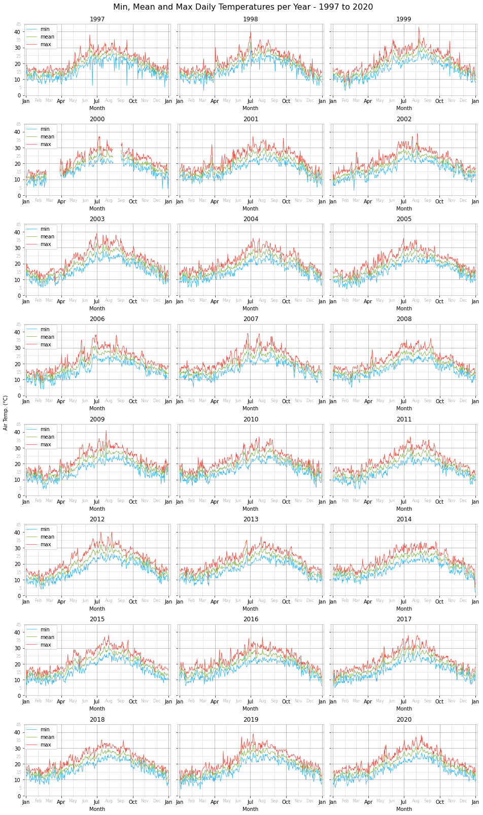
Looking at the daily temperature charts one can notice some missing data for parts of February, March and August 1997. Unfortunately, this cannot be filled in through interpolation since the time series gap is quite wide and spreads over several days.
Although we performed various sanity checks, filled missing data and fixed wrong data, it seems like two anomalous-looking daily minimum temperatures made it through anyway. A minimum temperature of 6°C was recorded in June and September of 1997. These are highly unusual temperatures for that time of the year and so most probably are data errors. However, their overall effect on the temperature statistics is negligible and so we will leave them as is. In future, a possible approach to detect these and other similar data errors would be to employ time series anomaly detection.
As regards the yearly pattern, as expected we notice a peak during summer around end of July and a trough in winter sometime during February.
Visually comparing the daily temperatures across the years does not yield any insight. All plots look relatively similar with small variations. To look into possible trends or changes we will look at the monthly temperature ranges.
Coldest and Warmest Daily Temperatures for the Years 1997 to 2020
pd.options.display.float_format = '{:.2f}'.format

min_temp_data = { 'Daily Temperature Type': ['Minimum', 'Mean', 'Maximum'],
                  'Date': daily.idxmin().apply(lambda x: x.strftime('%d %b %Y')),
                  'Minimum Temperature (°C)': daily.min() }
temp = pd.DataFrame(min_temp_data).reset_index()
temp = temp.drop(columns=['index'])
temp = temp.set_index('Daily Temperature Type')
display(temp)

max_temp_data = { 'Daily Temperature Type': ['Minimum', 'Mean', 'Maximum'],
                  'Date': daily.idxmax().apply(lambda x: x.strftime('%d %b %Y')),
                  'Maximum Temperature (°C)': daily.max() }
temp = pd.DataFrame(max_temp_data).reset_index()
temp = temp.drop(columns=['index'])
temp = temp.set_index('Daily Temperature Type')
display(temp)
| Date | Minimum Temperature (°C) | |
|---|---|---|
| Daily Temperature Type | ||
| Minimum | 31 Dec 2014 | 2.00 |
| Mean | 31 Dec 2014 | 5.17 |
| Maximum | 31 Dec 2014 | 7.00 |
| Date | Maximum Temperature (°C) | |
|---|---|---|
| Daily Temperature Type | ||
| Minimum | 22 Aug 2000 | 33.00 |
| Mean | 09 Aug 1999 | 35.54 |
| Maximum | 09 Aug 1999 | 43.00 |
Minimum, Mean and Maximum Monthly Temperature Ranges per Year - 1997 to 2020
fig, axes = plt.subplots(8, 3, figsize=(16,28), sharey=True)
plt.subplots_adjust(wspace=0.05, hspace=0.4)

chart_title = 'Min, Mean and Max Monthly Temperature Ranges per Year - {0} to {1}'
chart_title = chart_title.format(DATA_MIN_YEAR, DATA_MAX_YEAR)

plt.suptitle(chart_title, y=0.9, fontsize=MAIN_PLOT_TITLE_FONT_SIZE)

for n, (year, ax) in enumerate(zip(DATA_YEARS_RANGE, axes.flat)):
    filtered = monthly.loc[f'{year}']

    temp_month_charts = [{'daily_type':'dmin',
                          'dates': [date(x.year, x.month, 8) for x in filtered.index],
                          'colour':MIN_COLOUR,
                          'label':'min range'},
                         {'daily_type':'dmean',
                          'dates': [date(x.year, x.month, 15) for x in filtered.index],
                          'colour':MEAN_COLOUR,
                          'label':'mean range'},
                         {'daily_type':'dmax',
                          'dates': [date(x.year, x.month, 22) for x in filtered.index],
                          'colour':MAX_COLOUR,
                          'label':'max range'}]

    for chart in temp_month_charts:
        plot_y_error_bar(ax, chart['dates'], filtered[chart['daily_type']]['mean'],
                         [filtered[chart['daily_type']]['mean'] - filtered[chart['daily_type']]['min'],
                          filtered[chart['daily_type']]['max'] - filtered[chart['daily_type']]['mean']],
                         chart['label'], chart['colour'])

    ax.set_title(year, fontdict={'fontsize':SUB_PLOT_TITLE_FONT_SIZE})
    set_x_axis_as_months(ax, limits=(date(year, 1, 1),
                                     date(year, 12, 31)))
    set_y_axis_as_temp(ax, label='')
    set_grids_and_spines(ax)

    # display one legend per row
    if 0 == n%3:
        ax.legend(loc=(0,0.625))

fig.text(0.09, 0.5, 'Air Temp. (°C)', va='center', rotation='vertical')
plt.show()
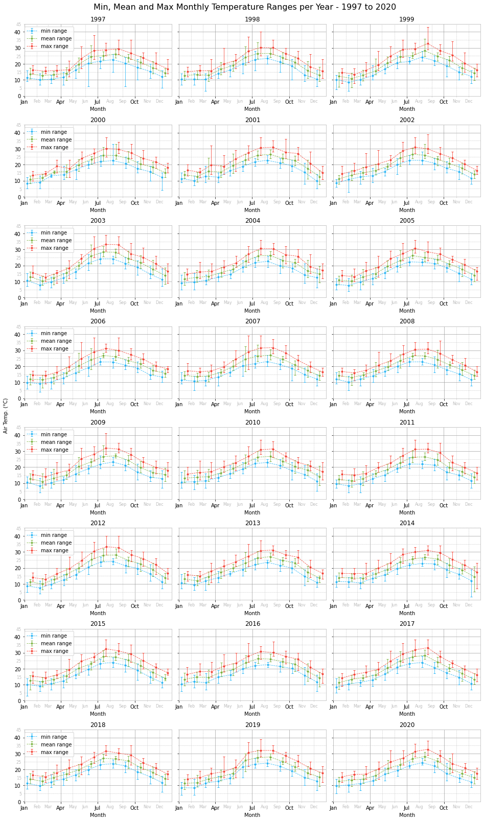
As with the daily temperature charts, one cannot perceive any significant changes from year to year just by looking at the monthly temperature ranges per year charts. A better approach is to plot the monthly temperature range for each month across the years in the data set and fit a linear equation trend line.
Minimum, Mean and Maximum Temperature Ranges per Month Across the Years 1997 to 2020
fig, axes = plt.subplots(6, 2, figsize=(16,24), sharey=True)
plt.subplots_adjust(wspace=0.05, hspace=0.3)

chart_title = 'Min, Mean and Max Temperature Ranges per Month Across the Years {0} to {1}'
chart_title = chart_title.format(DATA_MIN_YEAR, DATA_MAX_YEAR)

plt.suptitle(chart_title, y=0.9, fontsize=MAIN_PLOT_TITLE_FONT_SIZE)

trend_data = {'Month': [],
              'dmin': [],
              'dmean': [],
              'dmax': []}

for month, ax in zip(range(1,13), axes.flat):
    filtered = monthly.loc[(monthly.index.month == month) &
                           (monthly.index.year >= DATA_MIN_YEAR) &
                           (monthly.index.year <= DATA_MAX_YEAR)]

    temp_month_charts = [{'daily_type':'dmin',
                          'dates': [date(y, 4, 1) for y in DATA_YEARS_RANGE],
                          'colour':MIN_COLOUR,
                          'label':'min range'},
                         {'daily_type':'dmean',
                          'dates': [date(y, 7, 1) for y in DATA_YEARS_RANGE],
                          'colour':MEAN_COLOUR,
                          'label':'mean range'},
                         {'daily_type':'dmax',
                          'dates': [date(y, 10, 1) for y in DATA_YEARS_RANGE],
                          'colour':MAX_COLOUR,
                          'label':'max range'}]

    trend_data['Month'].append(calendar.month_name[month])

    for chart in temp_month_charts:
         # fit a linear equation
        coef, y_hat = fit_linear_equation(filtered[chart['daily_type']]['mean'])

        trend_data[chart['daily_type']].append(coef)

        ax.plot(filtered[chart['daily_type']]['mean'].index, y_hat,
                label=f'trend m={coef:.2f}', zorder=3, c=chart['colour'], lw=1, ls='-')

        plot_y_error_bar(ax, chart['dates'], filtered[chart['daily_type']]['mean'],
                         [filtered[chart['daily_type']]['mean'] - filtered[chart['daily_type']]['min'],
                          filtered[chart['daily_type']]['max'] - filtered[chart['daily_type']]['mean']],
                         chart['label'], chart['colour'])

    ax.set_title(calendar.month_name[month],
                 fontdict={'fontsize':SUB_PLOT_TITLE_FONT_SIZE})
    # just want minor grid lines without label
    set_x_axis_as_years(ax, limits=(date(DATA_MIN_YEAR,1,1),
                                    date(DATA_MAX_YEAR,12,31)),
                        minor=False)
    ax.xaxis.set_minor_locator(mdates.YearLocator(1))
    set_y_axis_as_temp(ax, '')
    set_grids_and_spines(ax)

    # re-ordering the legend
    handles, labels = ax.get_legend_handles_labels()
    ordered_handles = []
    ordered_labels = []
    for trend, errorbar in zip(range(0,3), range(3,6)):
        ordered_handles.extend([handles[trend], handles[errorbar]])
        ordered_labels.extend([labels[trend], labels[errorbar]])
    ax.legend(ordered_handles, ordered_labels, ncol=3)

fig.text(0.09, 0.5, 'Air Temp. (°C)', va='center', rotation='vertical')

plt.show()
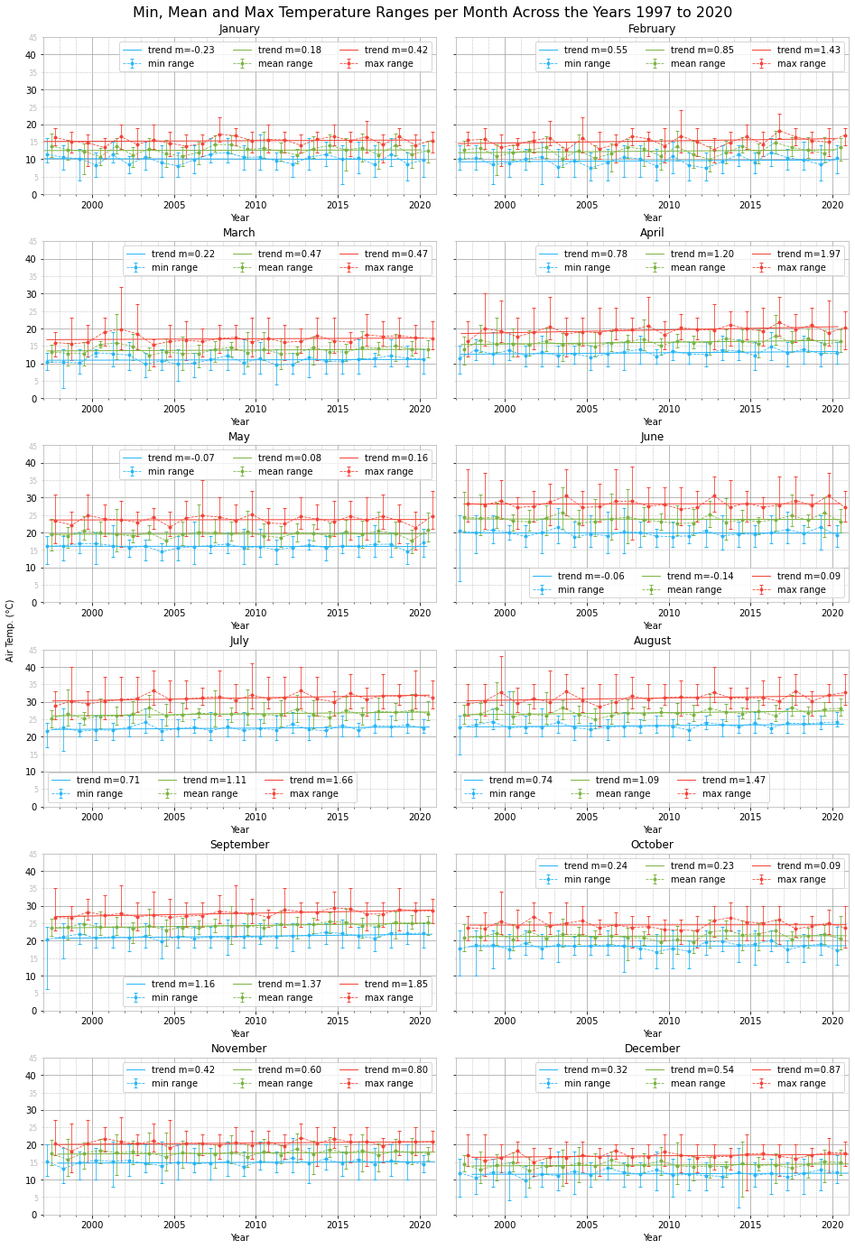
Looking at the trend lines and the rate of change $m$, we notice an overall positive trend for all months in all three temperature ranges, minimum, mean and maximum. The only exceptions are slight negative trends for the minimum temperature range in January, May and June and the mean temperature range for June.
The highest positive trend, $m>1$, is present across all three temperature ranges during September. High positive temperature trends, with $m>1$ for both mean and maximum temperature ranges, are also present in April, July and August.
January, May and June experienced the least change across the years analysed.
Although we do not have enough data to infer anything, seeing positive temperature trends over such a climatologically short period of time, 24 years, is food for thought.
Other interesting points to notice are visible outliers, the result of short-lived heatwaves or cold spells. For instance, notice the monthly maximum temperature range in August 1999 and the monthly temperature ranges in December 2014.
Trend Slope for Monthly Temperature Ranges Across the Years 1997 to 2020
trend_data = pd.DataFrame(trend_data).rename(columns={'dmin':'Minimum',
                                                      'dmean':'Mean',
                                                      'dmax':'Maximum'})
display(trend_data)
| Month | Minimum | Mean | Maximum | |
|---|---|---|---|---|
| 0 | January | -0.23 | 0.18 | 0.42 |
| 1 | February | 0.55 | 0.85 | 1.43 |
| 2 | March | 0.22 | 0.47 | 0.47 |
| 3 | April | 0.78 | 1.20 | 1.97 |
| 4 | May | -0.07 | 0.08 | 0.16 |
| 5 | June | -0.06 | -0.14 | 0.09 |
| 6 | July | 0.71 | 1.11 | 1.66 |
| 7 | August | 0.74 | 1.09 | 1.47 |
| 8 | September | 1.16 | 1.37 | 1.85 |
| 9 | October | 0.24 | 0.23 | 0.09 |
| 10 | November | 0.42 | 0.60 | 0.80 |
| 11 | December | 0.32 | 0.54 | 0.87 |
Coldest and Warmest Monthly Temperatures for the Years 1997 to 2020
min_temp_data = { 'Monthly Mean Temperature Type': ['Minimum', 'Mean', 'Maximum'],
                  'Date': monthly.idxmin().unstack().loc[:,'mean'].apply(lambda x: x.strftime('%b %Y')),
                  'Minimum Temperature (°C)': monthly.min().unstack().loc[:,'mean'] }
temp = pd.DataFrame(min_temp_data).reset_index()
temp = temp.drop(columns=['index'])
temp = temp.set_index('Monthly Mean Temperature Type')
display(temp)

max_temp_data = { 'Monthly Mean Temperature Type': ['Minimum', 'Mean', 'Maximum'],
                  'Date': monthly.idxmax().unstack().loc[:,'mean'].apply(lambda x: x.strftime('%b %Y')),
                  'Maximum Temperature (°C)': monthly.max().unstack().loc[:,'mean'] }
temp = pd.DataFrame(max_temp_data).reset_index()
temp = temp.drop(columns=['index'])
temp = temp.set_index('Monthly Mean Temperature Type')
display(temp)
| Date | Minimum Temperature (°C) | |
|---|---|---|
| Monthly Mean Temperature Type | ||
| Minimum | Feb 2012 | 7.52 |
| Mean | Feb 2012 | 9.98 |
| Maximum | Feb 2003 | 12.68 |
| Date | Maximum Temperature (°C) | |
|---|---|---|
| Monthly Mean Temperature Type | ||
| Minimum | Aug 1999 | 24.27 |
| Mean | Jul 2003 | 28.39 |
| Maximum | Jul 2003 | 33.19 |
Minimum, Mean and Maximum Temperature Ranges per Year
charts = [{'data': yearly, 'temp_title_prefix': ''},
          {'data': fl_yearly, 'temp_title_prefix': r"$\bf{Feels\ Like}$ "}]
chart_props = [{'daily':'dmin', 'colour':MIN_COLOUR, 'label':'annual min range'},
               {'daily':'dmean', 'colour':MEAN_COLOUR, 'label':'annual mean range'},
               {'daily':'dmax', 'colour':MAX_COLOUR, 'label':'annual max range'}]

for chart in charts:
    fig, axes = plt.subplots(1, 3, figsize=(16,5), sharey=True)
    plt.subplots_adjust(wspace=0.05, hspace=0.2)

    chart_title = 'Min, Mean and Max '
    chart_title += chart['temp_title_prefix']
    chart_title += 'Temperature Ranges per Year - '
    chart_title += '{0} to {1}'.format(DATA_MIN_YEAR, DATA_MAX_YEAR)

    plt.suptitle(chart_title, fontsize=MAIN_PLOT_TITLE_FONT_SIZE)

    filtered = chart['data'].loc[(yearly.index.year >= DATA_MIN_YEAR) &
                                 (yearly.index.year <= DATA_MAX_YEAR)]

    for props, ax in zip(chart_props, axes.flat):
        # fit a linear equation
        coef, y_hat = fit_linear_equation(filtered[props['daily']]['mean']['mean'])

        ax.plot(filtered[props['daily']]['mean']['mean'].index, y_hat,
                label=f'trend m={coef:.2f}', zorder=3)

        plot_y_error_bar(ax, [date(y, 7, 1) for y in DATA_YEARS_RANGE],
                         filtered[props['daily']]['mean']['mean'],
                         [filtered[props['daily']]['mean']['mean'] - filtered[props['daily']]['mean']['min'],
                          filtered[props['daily']]['mean']['max'] - filtered[props['daily']]['mean']['mean']],
                         props['label'], props['colour'])

        ax.set_title(str.title(props['label']),
                     fontdict={'fontsize':SUB_PLOT_TITLE_FONT_SIZE})
        set_x_axis_as_years(ax, limits=(date(DATA_MIN_YEAR,1,1),
                                        date(DATA_MAX_YEAR,12,31)),
                            minor=False)
        set_y_axis_as_temp(ax)
        ax.label_outer()
        set_grids_and_spines(ax)

        ax.legend(loc=(0,0.85))
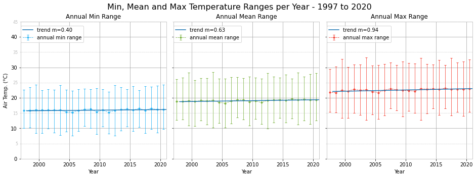
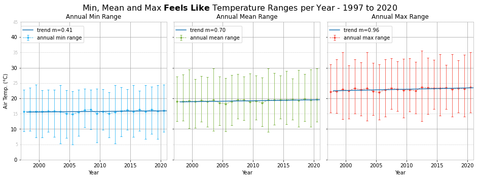
The positive temperature trends seen in the monthly plots result in a positive trend in the yearly temperatures. We also plotted the yearly feels like temperature ranges and the trend is slightly more positive. This suggests that not only is the weather getting warmer, it also feels much warmer due to a mixture of atmospheric conditions, such as relative humidity.
Wind Speed and Direction Charts
Defining Beaufort Scale Constants
BEAUFORT_BINS = [0, 2, 5, 11, 19, 28, 38, 49, 61, 74, 88, 102, 117, np.inf]
BEAUFORT_ENUM = enumerate(zip(BEAUFORT_BINS[:-1], BEAUFORT_BINS[1:]))
BEAUFORT_LABEL = 'Force {0} - {1}-{2} km/h'
BEAUFORT_LABELS = [BEAUFORT_LABEL.format(n, min_s, max_s) for n, (min_s,max_s) in BEAUFORT_ENUM]
Wind Speed and Direction Density per Year - 1997 to 2020
fig, axes = plt.subplots(8, 3, figsize=(16,36), subplot_kw={'projection': 'polar'})
plt.subplots_adjust(wspace=0.05, hspace=0.3)

chart_title = f'Wind Speed and Direction Density per Year - {DATA_MIN_YEAR} to {DATA_MAX_YEAR}'
plt.suptitle(chart_title, y=0.905, fontsize=MAIN_PLOT_TITLE_FONT_SIZE)

for year, ax in zip(range(DATA_MIN_YEAR, DATA_MAX_YEAR+1), axes.flat):
    w = df.loc[f'{year}', ['wdir', 'wspd', 'wdir_cardinal', 'gust']]
    w = w.loc[~w.wdir_cardinal.isin(['CALM', 'VAR'])]

    gusts = w.loc[w.gust > 0, ['wdir', 'gust']]

    ax.scatter(np.array(gusts.wdir.tolist())*(np.pi/180),
               np.array(gusts.gust.tolist()),
               s=20, c='#ce93d8', marker='x', label='Gusts')

    # display along wind cardinal directions
    #x = np.array([wdir_cardinal_to_deg(x)*np.pi/180 for x in w.wdir_cardinal])

    # display along actual wind directions
    x = np.array(w.wdir.tolist())*(np.pi/180)

    y = np.array(w.wspd.tolist())

    # estimate pdf using Gaussian KDE
    xy = np.vstack([x,y])
    z = gaussian_kde(xy)(xy)

    # sort values in ascending order of density
    # to ensure dense points are plotted on top
    idx = z.argsort()
    x, y, z = x[idx], y[idx], z[idx]

    ax.set_title(f'{year}', fontsize=SUB_PLOT_TITLE_FONT_SIZE)
    sc = ax.scatter(x, y, c=z, s=5, cmap=plt.cm.jet)

    ax.set_theta_zero_location('N')
    ax.set_theta_direction('clockwise')

    # wind/gust direction
    set_axis(ax, '', (0, 2*np.pi), 22.5*np.pi/180, None,
             lambda x,pos: wdir_cardinal(x*180/np.pi))
    # wind/gust speed
    set_axis(ax, '', (0,110), 10, None, lambda x,pos: '', axis='y')
    ax.grid(which='major', axis='y', linestyle='--')
    add_scale_to_polar_chart(ax, 'Wind Speed (km/h)', 20, 10, x_left_offset=0.025)

    ax.legend(loc=(-0.35, 0))

plt.show()
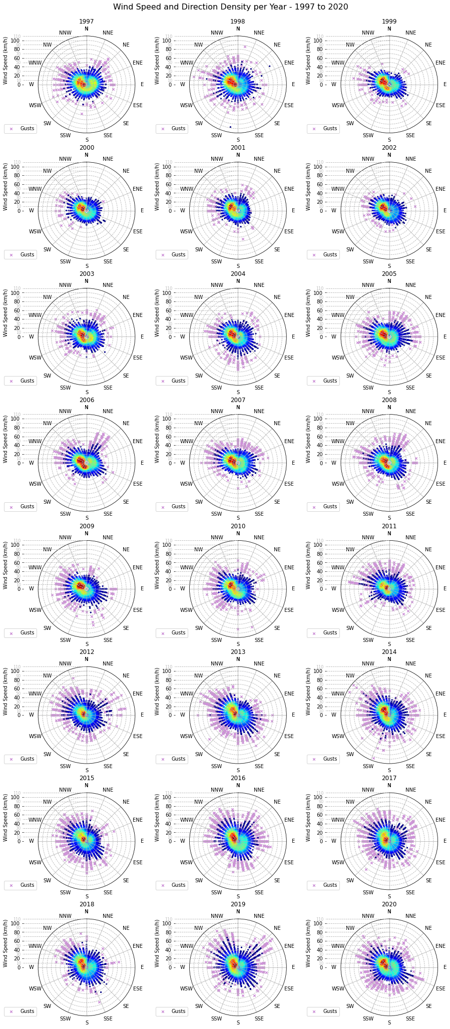
The prevalent wind direction between 1997 and 2020 lies between W and NNW, with the most common being WNW, followed closely by W and NW.
Wind Gust Speed and Direction Density per Year - 1997 to 2020
fig, axes = plt.subplots(8, 3, figsize=(16,36), subplot_kw={'projection': 'polar'})
plt.subplots_adjust(wspace=0.05, hspace=0.3)

chart_title = f'Wind Gust Speed and Direction Density per Year - {DATA_MIN_YEAR} to {DATA_MAX_YEAR}'
plt.suptitle(chart_title, y=0.905, fontsize=MAIN_PLOT_TITLE_FONT_SIZE)

for year, ax in zip(range(DATA_MIN_YEAR, DATA_MAX_YEAR+1), axes.flat):
    g = df.loc[(df.index.year == year) & (df.gust > 0), ['wdir', 'wdir_cardinal', 'gust']]
    g = g.loc[~g.wdir_cardinal.isin(['CALM', 'VAR'])]

    # display along wind cardinal directions
    #x = np.array([wdir_cardinal_to_deg(x)*np.pi/180 for x in g.wdir_cardinal])

    # display along actual wind directions
    x = np.array(g.wdir.tolist())*(np.pi/180)

    y = np.array(g.gust.tolist())

    # estimate pdf using Gaussian KDE
    xy = np.vstack([x,y])
    z = gaussian_kde(xy)(xy)

    # sort values in ascending order of density
    # to ensure dense points are plotted on top
    idx = z.argsort()
    x, y, z = x[idx], y[idx], z[idx]

    ax.set_title(f'{year}', fontsize=SUB_PLOT_TITLE_FONT_SIZE)
    sc = ax.scatter(x, y, c=z, s=20, cmap=plt.cm.jet)

    ax.set_theta_zero_location('N')
    ax.set_theta_direction('clockwise')

    # gust direction
    set_axis(ax, '', (0, 2*np.pi), 22.5*np.pi/180, None,
             lambda x,pos: wdir_cardinal(x*180/np.pi))
    # gust speed
    set_axis(ax, '', (0,110), 10, None, lambda x,pos: '', axis='y')
    ax.grid(which='major', axis='y', linestyle='--')
    add_scale_to_polar_chart(ax, 'Wind Gust Speed (km/h)', 20, 10, x_left_offset=0.025)

plt.show()
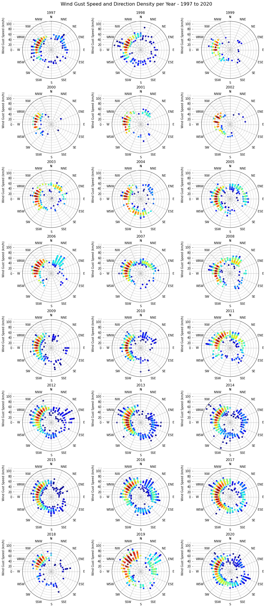
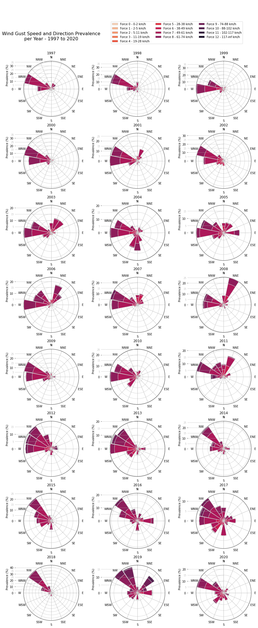
The highest concentration of wind gusts is unsurprisingly from the dominant wind directions, between W and NNW. There are some exceptions such as 2006 and 2019 with quite some gusts from the NNE and NE respectively, as well as 2016 from the E.
Furthermore, one can notice the medicane that hit Malta in November 2014 and the north-easterly storm of February 2019, both with wind gusts above 100km/h. The highest wind gust, 106km/h, was recorded on 7 November 2014 at 19:39.
Wind Speed and Direction Prevalence per Year - 1997 to 2020
fig, axes = plt.subplots(8, 3, figsize=(16,36), subplot_kw={'projection': 'polar'})
plt.subplots_adjust(wspace=0.05, hspace=0.3)

chart_title = f'Wind Speed and Direction Prevalence\nper Year - {DATA_MIN_YEAR} to {DATA_MAX_YEAR}'
plt.suptitle(chart_title, x=0.25, y=0.92, fontsize=MAIN_PLOT_TITLE_FONT_SIZE)

palette = sns.color_palette('rocket_r', n_colors=len(BEAUFORT_LABELS))

for year, ax in zip(range(DATA_MIN_YEAR, DATA_MAX_YEAR+1), axes.flat):
    w = df.loc[f'{year}', ['wspd', 'wdir_cardinal']]
    w = w.loc[~w.wdir_cardinal.isin(['CALM', 'VAR'])]
    total_events = w.shape[0]

    # Add a column for wind speed bins that will
    # hold the matching beaufort scale label by
    # binning the wind speed values into discrete
    # intervals matching the beaufort scale.
    # Then group the resulting DataFrame by
    # cardinal wind direction and beaufort scale
    # force. Finally compute the size of each
    # group and unstack them to get a row for
    # each cardinal wind direction and a column
    # for each beaufort scale force.
    s = ( w.assign(wspd_bin=lambda df:
                    pd.cut(w.wspd,
                           bins=BEAUFORT_BINS,
                           labels=BEAUFORT_LABELS
                          )
            )
           .groupby(['wdir_cardinal','wspd_bin'])
           .size()
           .unstack(level='wspd_bin')
        )

    # required for stacked bars
    s_cumsum = s.cumsum(axis=1)

    # compute as a percentage of total events
    s = (s/total_events)*100
    s_cumsum = (s_cumsum/total_events)*100

    x = [(wdir_cardinal_to_deg(x))*np.pi/180 for x in s.index.tolist()]

    ax.set_title(f'{year}', fontsize=SUB_PLOT_TITLE_FONT_SIZE)
    for n, c in enumerate(s.columns):
        ax.bar(x, s[c],
               bottom=0 if 0 == n else s_cumsum.iloc[:,n-1],
               label=c,
               color=palette[n],
               edgecolor="#cccccc",
               linewidth=1,
               width=0.375,
               zorder=3)

    ax.set_theta_zero_location('N')
    ax.set_theta_direction('clockwise')

    # wind direction
    set_axis(ax, '', (0, 2*np.pi), 22.5*np.pi/180, None,
             lambda x,pos: wdir_cardinal(x*180/np.pi))
    # wind direction prevalence
    set_axis(ax, '', None, 5, None, lambda x,pos: '', axis='y')
    ax.grid(which='major', axis='y', linestyle='--')
    add_scale_to_polar_chart(ax, 'Prevalence (%)', 10, 5, x_left_offset=0.025)

handles, labels = ax.get_legend_handles_labels()
fig.legend(handles, labels, ncol=3, loc=(0.43,0.93))

plt.show()
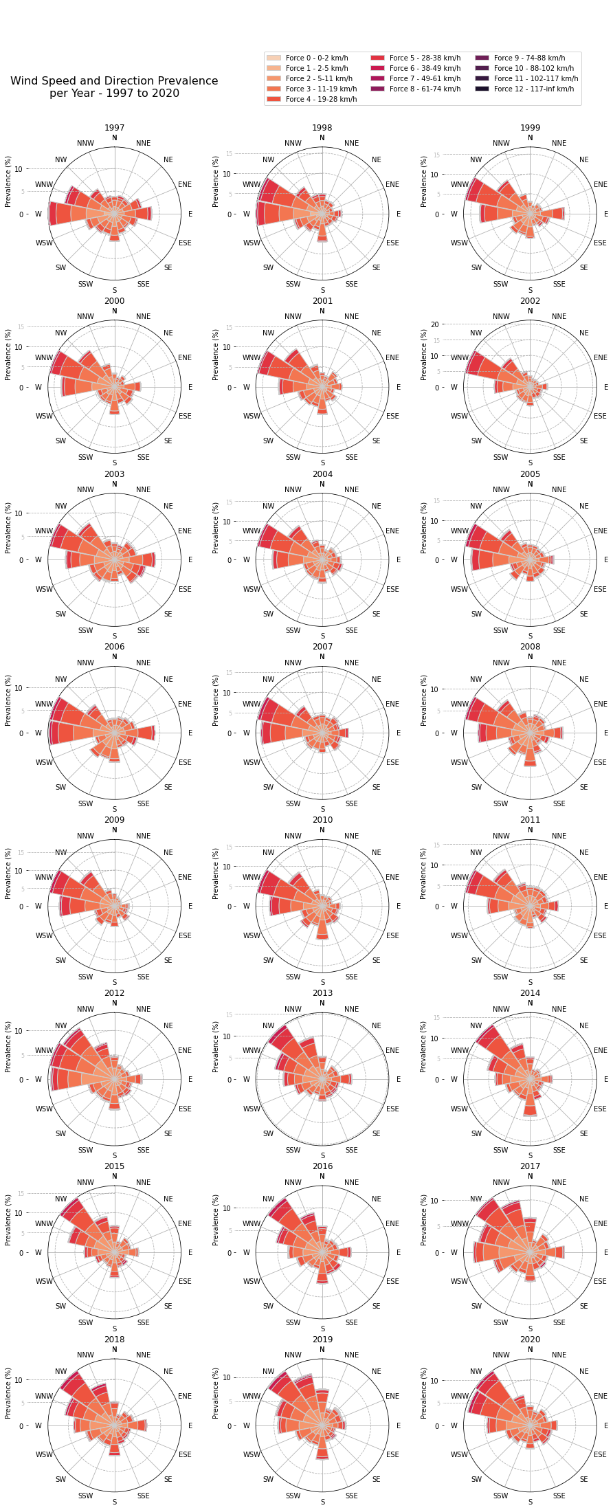
From the above wind rose diagrams we notice that the most prevalent wind direction changed from WNW to NW from 2013 onwards.
Wind Gust Speed and Direction Prevalence per Year - 1997 to 2020
fig, axes = plt.subplots(8, 3, figsize=(16,36), subplot_kw={'projection': 'polar'})
plt.subplots_adjust(wspace=0.05, hspace=0.3)

chart_title = f'Wind Gust Speed and Direction Prevalence\nper Year - {DATA_MIN_YEAR} to {DATA_MAX_YEAR}'
plt.suptitle(chart_title, x=0.25, y=0.92, fontsize=MAIN_PLOT_TITLE_FONT_SIZE)

palette = sns.color_palette('rocket_r', n_colors=len(BEAUFORT_LABELS))

for year, ax in zip(range(DATA_MIN_YEAR, DATA_MAX_YEAR+1), axes.flat):
    g = df.loc[f'{year}', ['gust', 'wdir_cardinal']]
    g = g.loc[(g.gust > 0) & (~g.wdir_cardinal.isin(['CALM', 'VAR']))]
    total_events = g.shape[0]

    # Add a column for gust speed bins that will
    # hold the matching beaufort scale label by
    # binning the gust speed values into discrete
    # intervals matching the beaufort scale.
    # Then group the resulting DataFrame by
    # cardinal wind direction and beaufort scale
    # force. Finally compute the size of each
    # group and unstack them to get a row for
    # each cardinal wind direction and a column
    # for each beaufort scale force.
    s = ( g.assign(gust_bin=lambda df:
                    pd.cut(g.gust,
                           bins=BEAUFORT_BINS,
                           labels=BEAUFORT_LABELS
                          )
            )
           .groupby(['wdir_cardinal','gust_bin'])
           .size()
           .unstack(level='gust_bin')
        )

    # required for stacked bars
    s_cumsum = s.cumsum(axis=1)

    # compute as a percentage of total events
    s = (s/total_events)*100
    s_cumsum = (s_cumsum/total_events)*100

    x = [(wdir_cardinal_to_deg(x))*np.pi/180 for x in s.index.tolist()]

    ax.set_title(f'{year}', fontsize=SUB_PLOT_TITLE_FONT_SIZE)
    for n, c in enumerate(s.columns):
        ax.bar(x, s[c],
               bottom=0 if 0 == n else s_cumsum.iloc[:,n-1],
               label=c,
               color=palette[n],
               edgecolor="#cccccc",
               linewidth=1,
               width=0.375,
               zorder=3)

    ax.set_theta_zero_location('N')
    ax.set_theta_direction('clockwise')

    # gust direction
    set_axis(ax, '', (0, 2*np.pi), 22.5*np.pi/180, None,
             lambda x,pos: wdir_cardinal(x*180/np.pi))
    # gust speed
    set_axis(ax, '', None, 5, None, lambda x,pos: '', axis='y')
    ax.grid(which='major', axis='y', linestyle='--')
    add_scale_to_polar_chart(ax, 'Prevalence (%)', 10, 5, x_left_offset=0.025)

handles, labels = ax.get_legend_handles_labels()
fig.legend(handles, labels, ncol=3, loc=(0.43,0.93))

plt.show()
Grouping and Aggregating Wind and Gust Speed Data
# winds
winds = df.loc[(df.wspd > 0) & (~df.wdir_cardinal.isin(['CALM','VAR'])), ['wspd']]
winds_monthly = winds.groupby(pd.Grouper(level='sample_time', freq='M')).agg(mean_wspd=('wspd','mean'))
winds_yearly = winds_monthly.groupby(pd.Grouper(level='sample_time', freq='Y')).mean()

# gusts
gusts = df.loc[(df.gust > 0) & (~df.wdir_cardinal.isin(['CALM','VAR'])), ['gust']]
gusts_monthly = gusts.groupby(pd.Grouper(level='sample_time', freq='M')).agg(mean_wspd=('gust','mean'))
gusts_monthly.dropna(inplace=True)
gusts_yearly = gusts_monthly.groupby(pd.Grouper(level='sample_time', freq='Y')).mean()
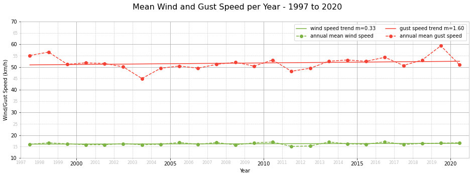
Mean Wind and Gust Speed per Year - 1997 to 2020
fig, ax = plt.subplots(1, 1, figsize=(16,5), sharey=True)

chart_title = f'Mean Wind and Gust Speed per Year - {DATA_MIN_YEAR} to {DATA_MAX_YEAR}'

plt.suptitle(chart_title, fontsize=MAIN_PLOT_TITLE_FONT_SIZE)

# fit a linear equation for annual mean wind speed
coef, y_hat = fit_linear_equation(winds_yearly.mean_wspd)

ax.plot(winds_yearly.index-timedelta(182), y_hat,
        label=f'wind speed trend m={coef:.2f}',
        c=MEAN_COLOUR,
        ls='-')

ax.plot(winds_yearly.index-timedelta(182), winds_yearly.mean_wspd,
        label='annual mean wind speed',
        c=MEAN_COLOUR,
        marker='o',
        ls='--')

# fit a linear equation for annual mean gust speed
coef, y_hat = fit_linear_equation(gusts_yearly.mean_wspd)

ax.plot(gusts_yearly.index-timedelta(182), y_hat,
        label=f'gust speed trend m={coef:.2f}',
        c=MAX_COLOUR,
        ls='-')

ax.plot(gusts_yearly.index-timedelta(182), gusts_yearly.mean_wspd,
        label='annual mean gust speed',
        c=MAX_COLOUR,
        marker='o',
        ls='--')

set_x_axis_as_years(ax, limits=(date(DATA_MIN_YEAR,1,1),
                                date(DATA_MAX_YEAR,12,31)))
set_axis(ax, 'Wind/Gust Speed (km/h)', (10,70), 10, 5, None, axis='y')
set_grids_and_spines(ax)

ax.legend(ncol=2)
plt.show()
Weather Phenomena Prevalence Charts
Creating Categorical Columns for Weather Phenomena
To be able to compute the prevalence of each weather phenomenon, we need to count the number of events for each weather phenomenon and calculate the percentage out of all weather events recorded in the period being investigated. To achieve this, we need to create a bool type column for each weather phenomenon, so that we can then group by years or months and compute the prevalence of each weather phenomenon by counting.
Before doing so, we first define a WX_PHRASE_PATTERNS dict to group wx_phrase patterns that refer to the same weather phenomenon. For example, thundery weather can be present under t-storm or thunder.
Furthermore, we define MAIN_WX_TYPES to cover the main weather phenomena. Through data exploration we found that the main weather phenomena are recorded throughout the data set, from 1997 to 2020. However, the rest of the weather phenomena, such as hail and rainy, are only recorded from 2014 onwards.
# cloudy, fair and windy data is available for all years
# all other weather phenomena start from 2014 onwards
WX_PHRASE_PATTERNS = {'cloudy': ['cloud'],
                      'dusty': ['dust'],
                      'fair': ['fair'],
                      'foggy': ['fog'],
                      'hail': ['hail'],
                      'hazy': ['haze'],
                      'misty': ['mist'],
                      'rainy': ['rain','drizzle'],
                      'thundery': ['t-storm', 'thunder'],
                      'windy': ['wind']}

MAIN_WX_TYPES = ['cloudy','fair','windy']

def wx_phrase_matches(wx_phrase, patterns):
    '''Returns whether the wx_phrase contains any of the patterns.

    Returns True if any of the patterns are present in
    the wx_phrase, False otherwise.

    Parameters
    ----------

        wx_phrase : str

            A wx_phrase, such as 'Cloudy', 'T-Storm' etc.

        patterns : iterable of str

            For example, a list of wx_phrase patterns,
            such as ['t-storm', 'thunder'].

    Returns
    -------

        bool

            Returns True if any patterns are present in
            wx_phrase, False otherwise.
    '''

    return any(pattern in wx_phrase.lower() for pattern in patterns)

for category, patterns in WX_PHRASE_PATTERNS.items():
    df[category] = df['wx_phrase'].apply(lambda v: wx_phrase_matches(v, patterns))

palette = sns.color_palette(n_colors=len(WX_PHRASE_PATTERNS.keys()))
Grouping and Aggregating Weather Phenomena Data
weather_per_year = df.loc[:, WX_PHRASE_PATTERNS.keys()].groupby(pd.Grouper(level='sample_time', freq='Y')).sum()
# compute percentage for each year
events_per_year = df.loc[:, 'temp'].groupby(pd.Grouper(level='sample_time', freq='Y')).count()
weather_per_year = weather_per_year.divide(events_per_year/100, axis=0)

weather_per_month = df.loc[:, WX_PHRASE_PATTERNS.keys()].groupby(pd.Grouper(level='sample_time', freq='M')).sum()
# compute percentage for each month
events_per_month = df.loc[:, 'temp'].groupby(pd.Grouper(level='sample_time', freq='M')).count()
weather_per_month = weather_per_month.divide(events_per_month/100, axis=0)
Weather Phenomena Across the Years 1997 to 2020
fig, (ax1, ax2) = plt.subplots(1, 2, figsize=(16,5))
plt.subplots_adjust(wspace=0.15)

# main weather phenomena chart
chart_title = f'Main Weather Phenomena {DATA_MIN_YEAR} to {DATA_MAX_YEAR}'
ax1.set_title(chart_title, fontsize=MAIN_PLOT_TITLE_FONT_SIZE)

for n, c in enumerate(MAIN_WX_TYPES):
    ax1.plot(weather_per_year.index.year,
             weather_per_year[c],
             label=c,
             linewidth=LINE_WIDTH,
             marker='.',
             color=palette[n])

set_axis(ax1, 'Year', (DATA_MIN_YEAR-0.25, DATA_MAX_YEAR+0.25), 4, None, None)
set_axis(ax1, 'Prevalence of Weather Phenomenon (%)', (0, 100), 20, 5, None, 'y')
set_grids_and_spines(ax1)
ax1.legend(ncol=3)

# other weather phenomena chart - 2014 to 2020 (7 years)
chart_title = f'Other Weather Phenomena {DATA_MAX_YEAR-6} to {DATA_MAX_YEAR}'
ax2.set_title(chart_title, fontsize=MAIN_PLOT_TITLE_FONT_SIZE)

for n, c in enumerate([wc for wc in WX_PHRASE_PATTERNS.keys() if wc not in MAIN_WX_TYPES]):
    ax2.plot(weather_per_year.index[-7:].year,
             weather_per_year[c][-7:],
             label=c,
             linewidth=LINE_WIDTH,
             marker='.',
             color=palette[n+len(MAIN_WX_TYPES)])

set_axis(ax2, 'Year', (DATA_MAX_YEAR-6.25, DATA_MAX_YEAR+0.25), 2, None, None)
set_axis(ax2, 'Prevalence of Weather Phenomenon (%)', (0, 5), 1, 0.5, None, 'y')
set_grids_and_spines(ax2)
ax2.legend(loc=(1.05, 0.5))

plt.show()
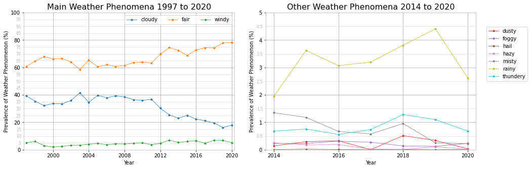
The main weather phenomena chart shows a dramatic increase in the prevalence of fair weather starting from 2012, with a corresponding decrease in cloudy weather. Wind prevalence has also increased slightly over the last 10 years. This does not necessarily mean stronger wind speeds, just more events. However, by fitting a linear equation to the annual mean wind and gust speeds we determined a positive trend for both.
From 2014 onwards the weather station also recorded other weather phenomena, such as rainy, thundery and so on. There is not enough data to reach any conclusions about trends, although rainy episodes seem to be on a slight increase. Just like for wind, this does not mean more rainfall, just more episodes of rain falling. The data set unfortunately does not contain rainfall measurements so we cannot determine the rainfall trend.
Main Weather Phenomena per Month for Each Year - 1997 to 2020
fig, axes = plt.subplots(8, 3, figsize=(16,32), sharey=True)
plt.subplots_adjust(wspace=0.05, hspace=0.3)

chart_title = f'Main Weather Phenomena per Month\nfor Each Year - {DATA_MIN_YEAR} to {DATA_MAX_YEAR}'
plt.suptitle(chart_title, y=0.905, fontsize=MAIN_PLOT_TITLE_FONT_SIZE)

for year, ax in zip(range(DATA_MIN_YEAR, DATA_MAX_YEAR+1), axes.flat):
    ax.set_title(f'{year}', fontsize=SUB_PLOT_TITLE_FONT_SIZE)

    for n, c in enumerate(MAIN_WX_TYPES):
        ax.plot(calendar.month_abbr[1:],
                weather_per_month.loc[str(year)][c],
                label=c,
                linewidth=LINE_WIDTH,
                marker='.',
                color=palette[n])

    set_axis(ax, 'Month', (-0.25,11.25), 3, 1, None)
    set_axis(ax, '', (0, 100), 20, 10, None, 'y')
    set_grids_and_spines(ax)

fig.text(0.09, 0.5, 'Prevalence of Weather Phenomenon (%)', va='center', rotation='vertical')

plt.legend(ncol=3, loc=(0.25,10.25))
plt.show()
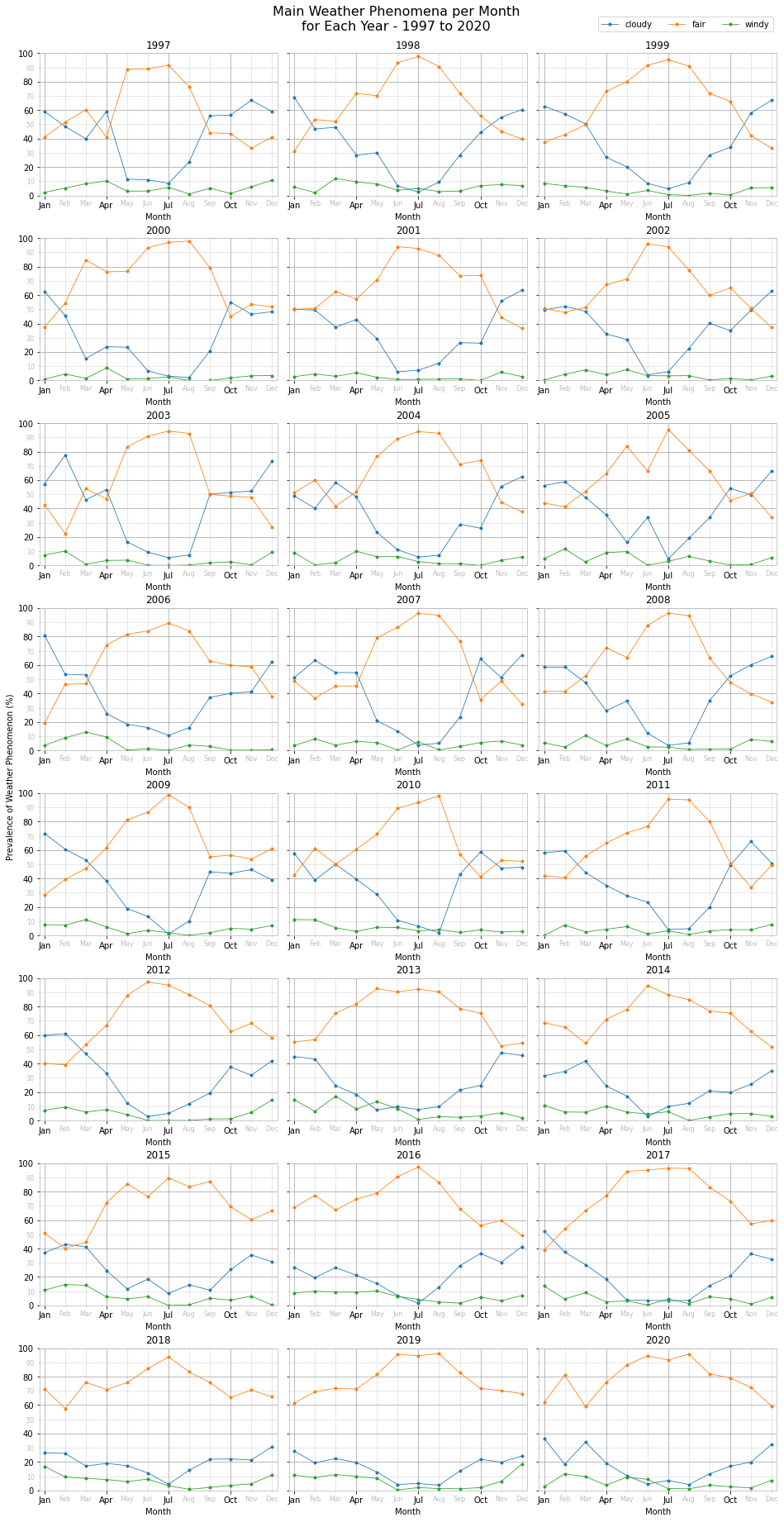
As expected, we notice fair weather dominating during the summer months of June, July and August, with May in late spring also being mainly fine. From around September to mid-October the weather phenomena start to invert, with more cloudy weather than fair. This pattern, give and take some brief exceptions, is present from 1997 to 2011. From 2012 onwards, although fair weather decreases during late autumn and winter months, it is still in the majority. Specifically, from 2018 to 2020, fair weather has dominated throughout the whole year, with an average prevalence of ~90% during the summer months and ~75% during the rest of the year.
Wind is prevalent throughout the year, with the exception of July and August during which very few wind events are recorded.
Other Weather Phenomena per Month for Each Year - 2014 to 2020
fig, axes = plt.subplots(3, 3, figsize=(16,12), sharey=True)
plt.subplots_adjust(wspace=0.05, hspace=0.3)

chart_title = f"Other Weather Phenomena per Month\nfor Each Year - {DATA_MAX_YEAR-6} to {DATA_MAX_YEAR}"
plt.suptitle(chart_title, y=0.95, fontsize=MAIN_PLOT_TITLE_FONT_SIZE)

for year, ax in zip(range(DATA_MAX_YEAR-6, DATA_MAX_YEAR+1), axes.flat):
    ax.set_title(f'{year}', fontsize=SUB_PLOT_TITLE_FONT_SIZE)

    for n, c in enumerate([wc for wc in WX_PHRASE_PATTERNS.keys() if wc not in MAIN_WX_TYPES]):
        ax.plot(calendar.month_abbr[1:],
                weather_per_month.loc[str(year)][c],
                label=c,
                linewidth=LINE_WIDTH,
                marker='.',
                color=palette[n+len(MAIN_WX_TYPES)])

    set_axis(ax, 'Month', (-0.25,11.25), 3, 1, None)
    set_axis(ax, '', (0, 15), 5, 1, None, 'y')
    set_grids_and_spines(ax)

axes[2,1].remove()
axes[2,2].remove()

handles, labels = ax.get_legend_handles_labels()
fig.legend(handles, labels, loc=(0.72,0.918), ncol=3)

fig.text(0.09, 0.5, 'Prevalence of Weather Phenomenon (%)', va='center', rotation='vertical')

plt.show()
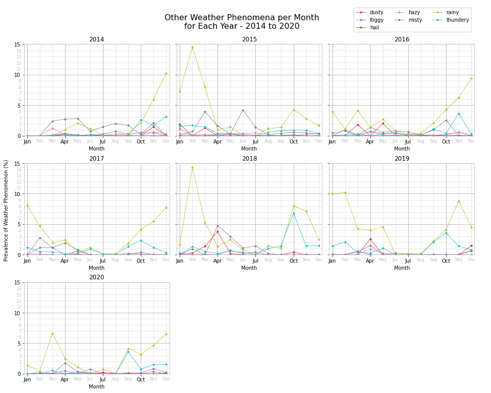
From the above plots we notice that thundery weather occurs most frequently during the month of October. Rainy weather occurs mostly during autumn, winter and early spring, and in general virtually no rainy events occur during the summer months, especially July and August.
Conclusion
In this notebook, we downloaded weather data for Malta from the Malta International Airport weather station located in Luqa, Malta. The data covers the period from 1 July 1996 to 30 September 2021. However, we analysed only the complete years from 1997 to 2020, 24 years of weather data in total. After cleaning and preparing the data we focused on visualising three weather properties, namely: temperature, wind and weather phenomena.
Temperature
Over 24 years, a very brief period climatologically, we notice an increase in the mean annual temperatures, with $m=0.63$. This positive trend is also present for the feels like temperature, with $m=0.7$. Comparing months through the years, we determine that September has the steepest increase with $m=1.37$. April, July and August also register $m>1$ temperature trends. The months that experienced the least change in annual mean temperature are January, May and June.
Wind
Since 2012, the most prevalent wind direction is NW. Before it used to be WNW. Wind gusts are the most prevalent in the west to north quadrant, with some years also experiencing frequent gusts from the NNE and NE. The mean annual wind speed is ~16km/h and the mean annual gust speed is ~51km/h. Both registered a positive trend, $m=0.33$ for mean annual wind speed and $m=1.60$ for mean annual gust speed. So it seems like storms are becoming more violent with gusts being more powerful. The medicane that hit Malta in November 2014 and the north-easterly storm of February 2019 are evidence of stronger storms hitting the Maltese islands. The highest wind gust recorded was 106km/h on 7 November 2014.
Weather Phenomena
Fair weather used to dominate the late spring, summer and early autumn month period. However, from 2012 fair weather is remaining dominant across the whole year, albeit at a lower prevalence percentage. July and August tend to be very calm as regards wind phenomena. Thundery weather is most frequent during October. Rainy weather picks up during late autumn and winter and is at its lowest, with virtually no rainfall during July and August.